I think its an excellent idea. I did it in my last home – a shiny glossy black over my dining room table, and I think I will more than likely do it to some scale in this new LA rental………
Talking about replacing light fixtures with spray painted brass chandeliers from the thrift store. An easy find, and a good idea for renters, especially if you don’t break your landlord’s piece that you are gonna stash. It is a great way to replace some lacking style with your own cheap trick for the temporary.
I’ve created this AWESOME photoshop sketch to map some ideas for my new tiny kitchen.

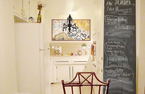
As I plan a rental version of an update, I am wondering if a kinda tiny interesting chandelier is what needs to hang above the sink??? I like the idea of the ornate fixture being in a less expected location – rather than the trad placement over the dining table. Can you envision it here?
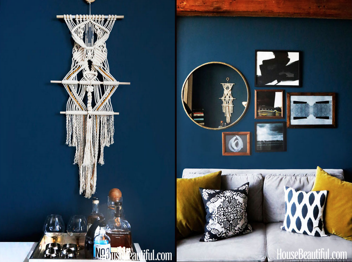
Eh.. I’m not totally sold…. just thinking of options…. Meanwhile, take a look at this great collection of spray painted chandies. (an image that i grabbed directly from Apartment Therapy). Yay!!


Oh, I approve! The only difference between a “meh” kitchen and a great kitchen is the details! What kind of lighting is currently there that you plan on replacing? And lovely artwork btdubbs! Just saying!
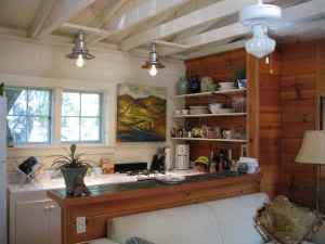
ha your landlord should seriously consider a counter-depth fridge! the whole place would be much better if that thing wasn’t sticking out in to the kitchen like that.
Oh and-I am really liking Kate’s chairs more and more. I like your hardware choice and you’re artwork, although I agree w/you on placing the chandy in a surprise spot I’m not crazy about it in the kitchen.
Nice photoshopping! I have to know where the art is from – I love it.
I LOVE this! So excited about the fact that my obsession with chalkboards and chandeliers could possibly have a place. The accessories you have added to the not ideal tile really add!
The art is Angela Adams and will probably only be in the photoshopped version of my kitchen. its a little pricey for my poor self…. :)
Glad you like Kate.
I must say that the Photoshopped version is awesome! Nice job. And if only there was a Photoshop to real life converter. I’ll start to work on that.
oooh! I hope its a quick turnaround.
UPDATED the picture size due to request. I thought the photoshop job was pretty poor (thus the AWESOME adjective!!) – but thanks y’all.