An email from Vincent,
I can tell a lot of thought was put into the Indiana Project house. Everything from keeping the color scheme flowing to installing the recessed can lights in the perfect spots. I could go on, lol. One question though…If this was your house what paint colors would you keep or not, and what rooms would you use more bold colors in?
Dear Vincent,
Thank you for your compliments about the Indiana Project, its a great feeling to put something out there and receive positive feedback!
If the Indiana house was my own I would’ve made a lot of different choices and not just in the color department. But you’ve asked about color and I’m happy to oblige.
The first change that comes to mind is the half bath. I like the idea of half bath that is either bold in color or bold in pattern. Here is the half bath from the Indiana house painted Benjamin Moore’s Winter Lake,
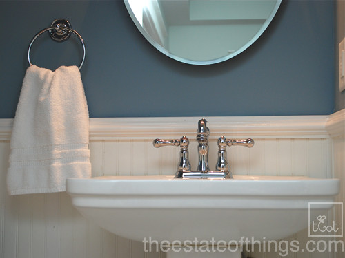
While Winter Lake is a lovely color, I probably would’ve gone darker maybe something with a little more gray in it.
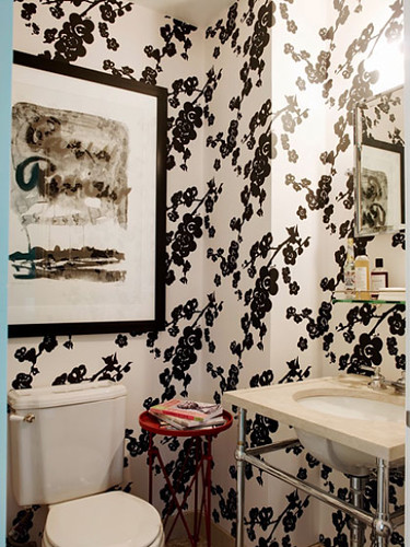
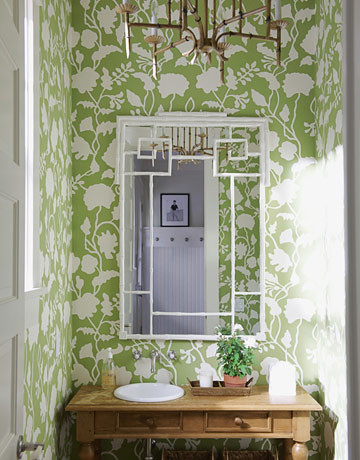
Or maybe a graphic wallpaper with or without wainscoting,
Rita Konig
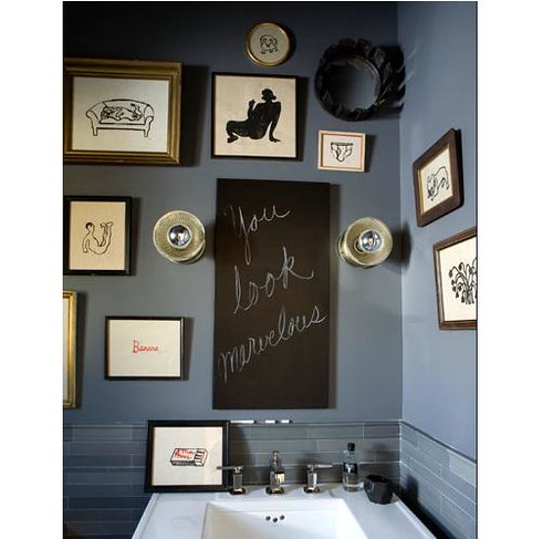
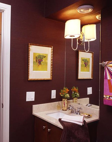
or maybe a different color all together, this looks like one of those great eggplant/brown colors that seems to change throughout the day
Canadian House & Home
The bedrooms would be another change. Bedrooms are pretty personal but at the Indiana house we didn’t know who would live there so I went with a neutral white with a hint of beige called Soft Chamois (Benjamin Moore). Boring if you ask me but I had to remain neutral. I personally like a lot of wispy grays and a hint of blue so that’s what the master would’ve been. A second bedroom for my little DC (almost 3 yrs old) probably would’ve been painted a light aqua color and the last bedroom for guests would’ve been guided by fabric and bedding choices.
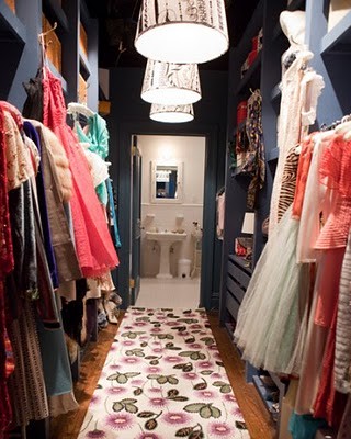
The walk through closet at the Indiana house was also Soft Chamois but if it were my closet I probably would’ve painted it something more fun. The closet in the master bedroom at Bungalow 404 was Benjamin Moore’s Mink which is a dark chocolate brown. A charcoal gray would also be a fabulous choice for a walk in I think or it could be a place to try out some great wallpaper too.
Carrie’s closet on Sex in the City
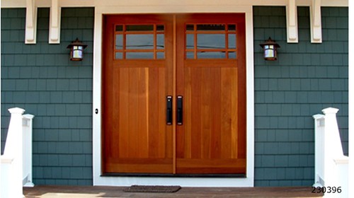
And this might be a surprise considering I lamented over it so much but I wouldn’t have painted the front door yellow. I would’ve installed a much more expensive door and had it stained for a more timeless look.
I could go on Vincent but I’m going to end it here. Congratulations to you and your wife on the purchase of your house. There are lots of opportunities to customize your new space.
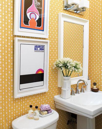
Paint and new light fixtures are going to go a long way in your new place! I think we are probably in agreement that the floral wallpaper has gotta go in the powder room! Have you got any suggestions for Vincent?


Thanks for playing,




We renovated a 150+ year old house. For me, trial and error was the only way I found what worked. I think the longer I lived in the house, the more clear the design direction became. I would’ve worked with a designer to develop plans room by room. That way you have a clear plan of what to purchase and commit to a look. There are lots of affordable e-designers out there now and they can save you money and identify what will give you the biggest bang for your buck. Often times I bought what was on sale or changed direction with an impulse buy. In retrospect I would’ve been better off saving for more expensive, better quality items I really wanted.
Danielle, I would have to agree with you. Living in a house will give you much better idea of what colors work best that room. Since this is my first home, I’ve never thought about picking paint colors. The hardest part for me is making colors flow from one room to the other. My last paint scheme was a burnt orange for entry, green rygrass for the living, red w/ waintscotting for the dining, and white, light blue or gray for the kitchen. I’m re-thinking it now because its to many colors. When I get home I can post the colors and maybe get some options.
Vincent,
The colors in the Indiana Project flow because they are all the same intensity and are all relatively subdued and calming hues. Make sure to get some samples and paint them up before you commit, the samples at Lowe’s are only about $3 with tax.
Vincent – you are wise to put thought into paint colors & flow … reading up on design blogs is a big help. It isn’t easy getting paint right. I used to look at paint chips to choose colors. Now I read about the tried-and-true colors designers are using and check those out. I learned the hard way about too many paint colors. There are several rooms in our house that were repainted two or three times! Now I understand the joke about how every new homeowner paints a red wall. :) Enjoy the process and good luck!
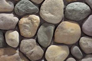
Whatever you do, play up that gorgeous fireplace and those windows. Maybe plantation shutters? In the bathroom take down the wallpaper and add wainscoting with a deep teal or blue paint. For the sink I would choose something along the lines of this: http://www.bathroomvesselsinks.com/eb_s019rr-p~natural-river-rock-boulder-sink—polished-interior.asp. Since it looks like a smallish bathroom you want it to pop. Flooring, I would go either a herringbone or 4 clip tile pattern. Nothing too busy because you want everything to flow together and not look like a hodge podge of things. I’m all for hanging family photos in the bathroom. It’s cheap and easy. The kitchen I’m feeling a smokey blue for the cabinets and subway tile as a backsplash. Open up some of the cabinets and replace the doors with glass.