
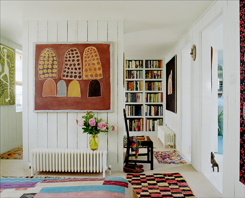
Poster from the home of Audrey Mascina and Jerome Sans, The Selby
My friend Kristin keeps asking me to come over and help her figure out what to do with several areas in her new apartment. Kristin has a problem that many people face as renters. How can I give my apartment with hospital white walls and mini-blinds some pizazz.
Kristin used to work in radio and during that time she amassed quite a collection of concert posters. She doesn’t want to get rid of of them and some of them she cherishes.
In the absence of a large wall in the apartment, where can she display her collection?
My recommendation was to hang them salon style above her bed. This is the biggest wall in the apartment. This also solves another problem, what direction should she go in for a color scheme. Hanging the collection over her bed solves both of these problems, she brings in all the colors from all of the different posters in to the room AND a location for the collection has been selected. Since she already has white walls I suggested that the bedding and all other accessories either be white or neutral and rely solely on the posters to carry all the color.
Images from Aaron Rose’s apartment, The Selby


Image from Living Etc
Her second question:
How can I make my desk a little more bedroom friendly?
The only space option for the computer and desk is in her bedroom. Her desk leans a little more toward OfficeMax than she might like.
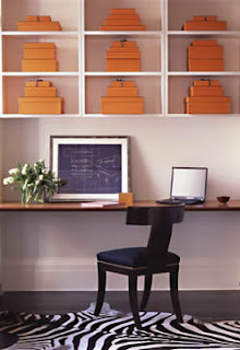
My suggestion is to find a new desk that functions as both a vanity and a workstation. Kristin will be buying a laptop to replace her desktop soon, so the computer will take up less desk space. I think that West Elm’s Parsons desk could be the remedy. It’s sleek and classic and you could feel just as comfortable sitting at the Parsons surfing the net as you would putting on your makeup in the mirror.

I suggested maybe putting some small bowls (ceramic, woven, wooden etc) out to hold jewelry and a mirror to give it more of a vanity-type feel. Â Small mismatch bowls of all descriptions can be picked up a flea markets and thrift stores.
Image from Daisy Cottage

Little Birch Jewelry Stand from Urban Outfitters
After seeing Kristin’s place for myself, I realized that she has quite a mish-mash of personal memorabilia spread throughout the living area and bedroom. There is an absence of continuity in style, design and color. To take the first strike at this problem, I suggested that she go through everything including what is stuffed in her closet and begin editing. She should keep the things that are part of her personal history but store them if they don’t contribute to the aesthetic appeal of her space. Eliminate things that she has been harboring just because. Maybe someone else will enjoy that fairy figurine your friend gave you for your birthday or the iron cross you bought during your short-lived goth phase.
We’ll check in with Kristin later to see how she is progressing with personalizing her space.Thanks for playing,




Oh. Paint that headboard your most favorite bold color. :)
i used to have that same desk!!! thanks office depot!!