Every once in a while its good to get an eye full of some good design. Personally, I like to get my design candy fill several times a day but not everyone likes to “OD” on design.
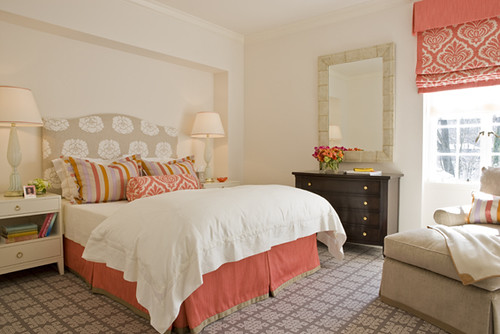
I was admiring the San Francisco home that Melissa Warner of the design firm Massucco Warner Miller, designed in the April issue of Traditional Home. I realized that Warner was already on my radar because I had a few of the rooms that MWM designed saved in TEOT’s Flickr inspiration files. The following are some of my favorites from the group’s portfolio.
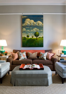
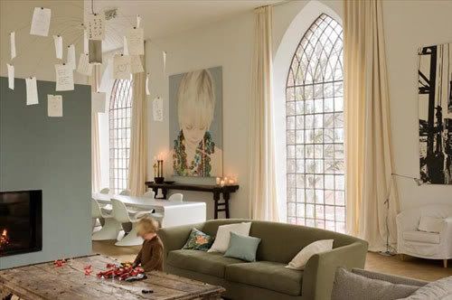
I like the fact that the children that live in this home are allowed to run all over the velvet covered round social bench.Â
And…
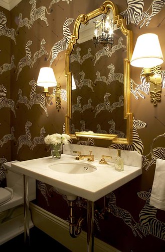
Heather Clawson at Habitually Chic is intriqued by that zebra wallpaper installed in the powder room below. In case you were wondering, its Scalamandre. Heather points out in her post that the zebra was spotted in Margot Tenenbaum’s bathroom, the Royal Tenenbaums set was so great wasn’t it! Here’s the application of the paper in Safari Brown.
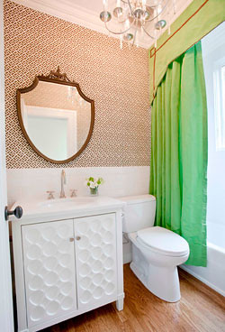
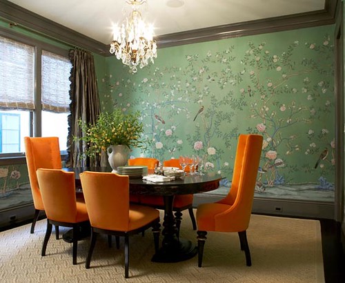
Liking the contrast of the orange against that floral wallpaper. Just when this room was about to get too serious BAM orange chairs.  I’m not as good with wallpaper so you’ll have to forgive me I don’t know the source, but I’m about 99% sure it was on the cover of Domino, therefore I should know it. If you know the source holla.
Isn’t that chandy at Karen’s Attic, posted about yesterday…..yeah I thought so
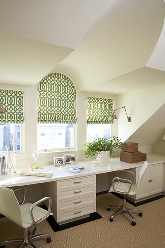
Done with Imperial Trellis yet?…..nope
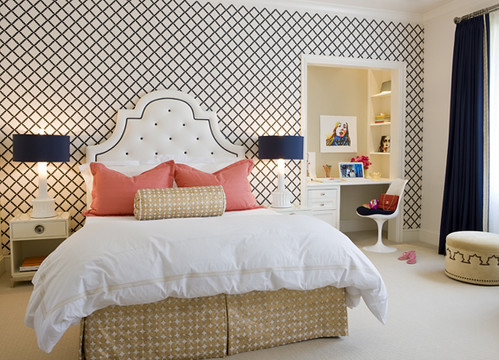
A girl’s bedroom, looks like a closet might have become a work/study area.
Thanks for playing,


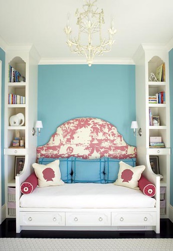
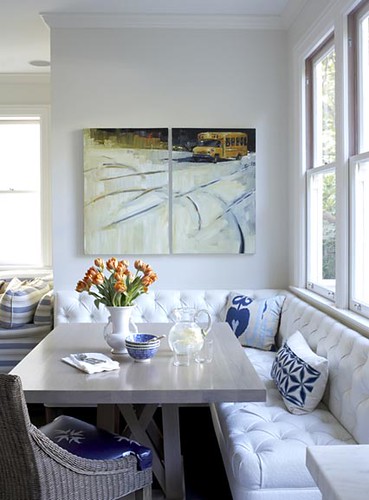




Those silhouette pillows are adorable, and I love that bus painting too!
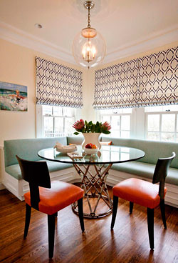
Okay, I found it: THAT is my new breakfast nook! (Do people still say “nook”?) So perfect. Especially the lamp. Any source thoughts on that?
SFKate-you can find a fixture like that at West Elm on sale right now and yes the use of the word nook is still totally acceptable, we would however need to discuss the use of the phrase “light and airy”