Hi friends,
Thanks for stopping in.
I wanted to give you guys a look at the final design of the mini-kitchen in our new brick and mortar shop.
For a quick refresher, SHOP TEOT is laid out very much like an apartment. We took that idea and ran with it.

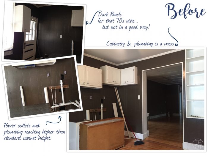
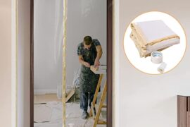
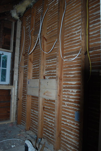
Before we came along, the space was a salon. The back room that we turned into our kitchen had some really ugly exposed PVC piping and bit of a mess of some cabinetry. With the help of our crew, we pulled it all out, capped it off and started afresh with a miniature kitchen build.
This is where we were when we signed the lease.
Having a mini kitchen built into the retail space serves a number of functions.
It’s wonderful for presentation and merchandising of our newly expanded kitchen and housewares collection. A sink is always a good idea, from washing dirty DIY hands to late nights with a bit of sour beer to get you through the tagging and pricing process. Of course, the whole setup plays host nicely for catered parties as well.
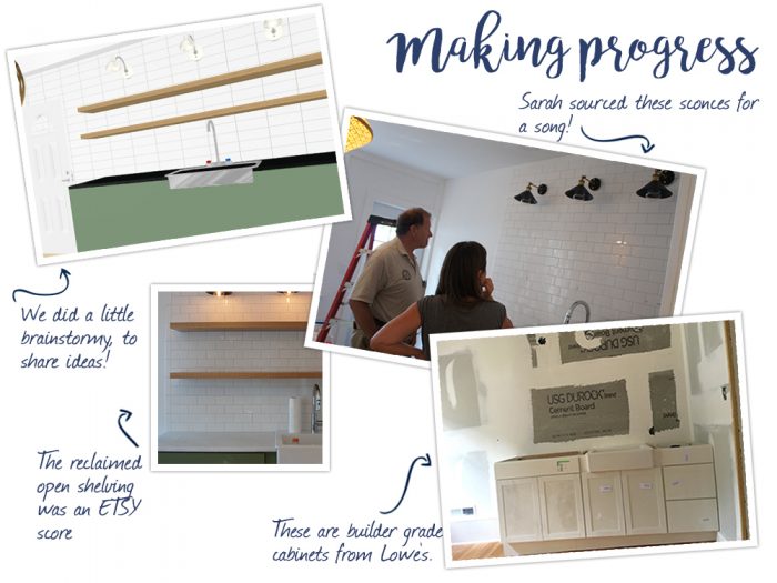
Sarah knew pretty immediately that she wanted to put in some pesto green kitchen cabinets and an apron front sink. She zeroed in on a paint color called Artichoke, by Sherwin Williams.
You might have guessed it, but a quick look at the history of our kitchen trends will find that our blog pretty much nails the final product. We have our sconces, our open shelving, our favorite cabinet hue, brass pulls, mixed metals, and white subway tile!
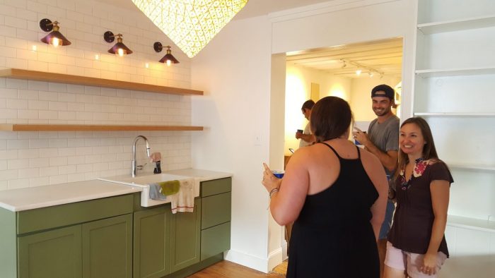
It all comes together for a modern take on classic design! Here’s the final look. We hope you love the result as much as we do!

Many thanks to Rachel Garrison for the photography!
SOURCES:
Black Sconces | Shaker Style Cabinetry | Pesto Paint Color | Reclaimed Shelves | Apron Front Sink | White Subway Tile
Shop the TEOT Kitchen Collection




I think you had me at open shelving. Your mini-kitchen looks great! And y’all have a fantastic eye for design.
Ooh, thanks so much Amy! <3