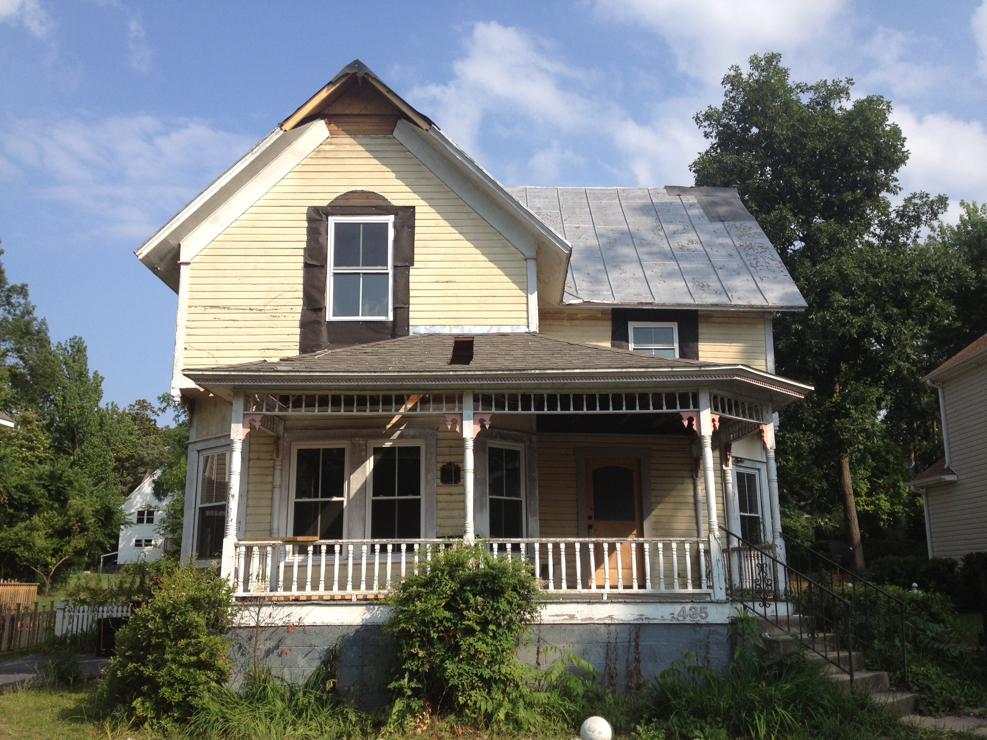
To review… the Grout Cottage is a Queen Anne built in 1895. It is a duplex that we began remodeling in December 2012. Here’s the introduction post to the house.
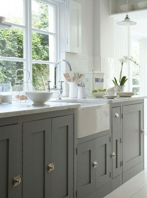
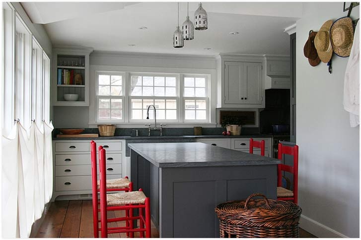
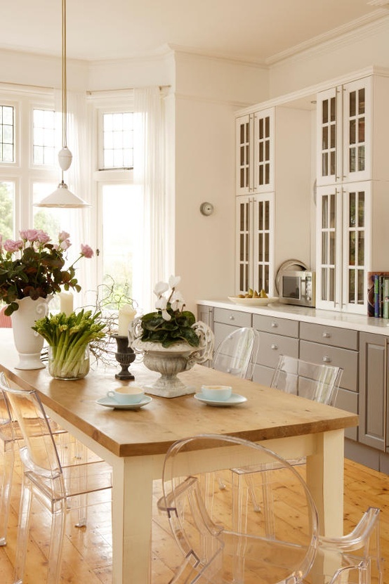
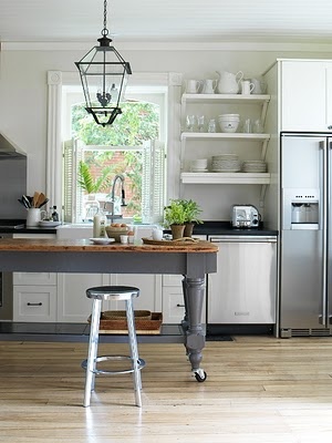
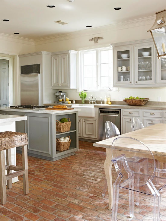
Beginning at the early stages of planning the kitchen for the Grout Cottage project I knew I wanted to do gray lower cabinets and white upper cabinets. These were the images I often referenced.
But before those finish decisions are made I needed to layout the kitchen and with the help of my cabinet maker, Quality Cabinet Company we got it done.
I tried to turn the corner with the cabinets and build the fridge in next to the window but we just couldn’t make it work. This was the kitchen in Apartment A after it was all primed.
Although we have a small pantry, we were really only working with the back wall of cabinets. The appliances and a double sink took up most of the counter space there so we needed an island for both counter space and additional cabinet and drawer storage. We needed a functional island and I think we got just that. I doodled those goofy bin pulls on there. The end caps and the other side of the island have shaker panels much like the dark grey island in the inspirational photo above.
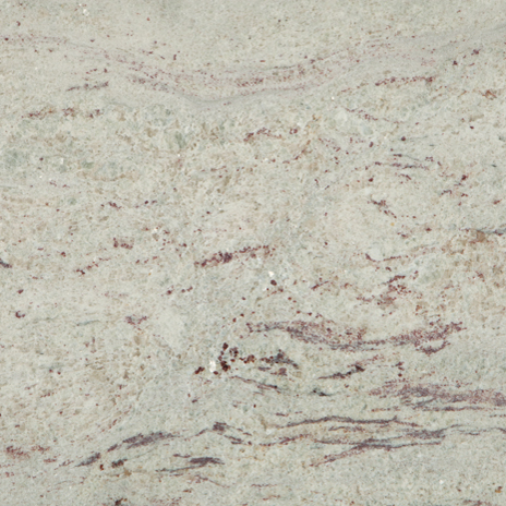
Of course I would love to do a quartz countertop that mimics carrera marble but this is an apartment and I needed to remain mindful of costs. First, I priced out granite tiles with custom bullnose at my local tile showroom and found that by the time I paid for the material and labor I was pretty close to a solid surface granite. So I opted for Level 1 granite, a nice River White slab.
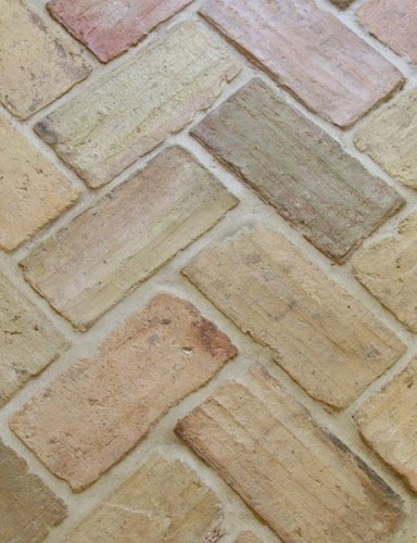
Initially I had my heart set on a brick floor in a herringbone pattern. I priced out the thin brick pavers for indoor application and it wasn’t outlandish but again adding the labor in was outside of the budget so I decided on some affordable 12×12 tiles in a neutral cream hue from Lowe’s with light grey grout to pick up the grey lower cabinets. For a bit of interest I asked the installer to lay the tiles in a brick pattern so it doesn’t look so much like a 12×12 grid. I always make a point to use TEC Power Grout especially in apartments/rentals because it’s stain resistant and you don’t have to seal the grout, trying to keep the grout looking fresher longer.
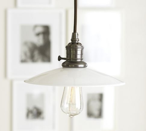
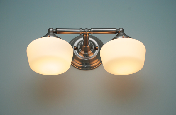
I really like Pottery Barn’s classic pendant collection and I like the price point and I thought it would be fitting to use the Edison bulb because of the age of the house. I wanted a bit of an industrial look and for a while I bounced back and forth between the white shade and a silver shade but finally purchased two of the Easton pendants to mount over the island. I chose the bronze cord as shown in the picture for some contrast in the white kitchen.
Because its a rental we can’t exactly install a Rohl bridge faucet so I opted for something a little unique, the Portland faucet at a great price from Overstock. Rounding out the details are classic bin pulls and knobs from Lowe’s and stainless appliances.
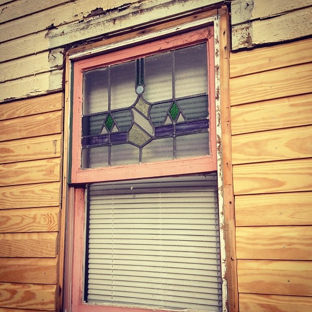
In the kitchen window above the sink was some stained glass in a 1980s replacement window that may or may not have been original to the house. Whether or not it was original it had been there with the house for many years so we decided to preserve it. After some discussion about creative ways to mount it to look as if it was part of the window, we decided the best/easiest thing to do was to re-frame it and suspend it in front of the top half of the window on a small chain.
Stay tuned…the painters are there today doing their final touch up. The downstairs apartment is about a week away from being photo ready.
Thanks for playing,







Sarah,
We are trying to renovate our 1920’s house on the cheap so that we can rent it out in a few years. When you choose your appliances and sink for the Grout Cottage kitchen would you possibly let me know what you pick? You are totally helping me keep on track here. I was looking at Portstone brick for the kitchen and mudroom as well. Couldn’t you be our virtual contractor here in Charlotte??? :) kidding…sort of? Keep it coming….love your work.
Stephanie,
The sink and appliances are here. I’ll list everything in the final reveal. But I let the countertop people put their standard double bowl in and I’m not impressed. I will purchase my own sink next time. I like Overstock, IKEA or Lowe’s for stainless sinks. Sign me up for virtual contracting. Thanks!
I love your kitchen inspiration photos. I am actually planning on doing a very similar concept in my new house, not to far from you in Sanford NC. I was wondering if you had the source for that first inspiration photo? thanks!
Jenn-
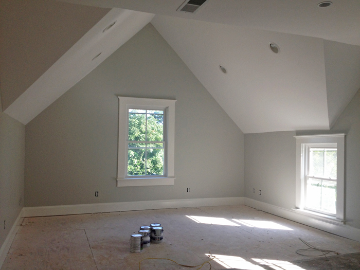
I don’t have the source for that one, I pinned it a long time ago and I’ve noticed it makes the regular rounds among the 100 or so people that I follow on Pinterest. The gray hue of those cabinets is really good and I wanted it to be somewhere in between that gray and the gray of the built-ins in the 3rd image. I think I came pretty close with Farrow & Ball’s Pavilion Gray.
You are right down the road! Sanford is the land of affordable bungalows, I troll the real estate listings there for funsies sometime.
Thanks Sarah for the info on the paint, it is a lovely color. I almost bought two different bungalows in Sanford when I was house hunting last november! I still keep an eye on them even though I did end up purchasing a modern-ish looking ranch. Good bones, well built, lots of potential, but man… those bungalows get me. It’s my favorite house style for sure!!! I can’t wait to see your finished kitchen. I’m leaning toward a darker gray for my lower cabinets, but I just love the hardware and the style of cabinetry in that first photo. The sink is pretty rad too (though a farmhouse is probably out of my budget)!
IKEA’s apron front double bowl is $312, my friend installed one in a little cottage makeover and it looks great! Overstock has a few to choose from also, you might want to go apron front stainless in a ranch. It really is a unique look I’d probably do it.
Dark grey is good too, how about those that straddle the line between navy and charcoal, those are cool hues too for lower cabs.
I was totally thinking about charcoal. I did it in my master bathroom and I love how it looks. The in between charcoal and navy/dk blue is a contender. The ikea sink is an option. The only thing I don’t like as much about that one is that it’s not really under mount. I would love love the stainless apron sink. I just assumed they’d be super expensive, but I think I’ll look again on overstock. Do you know if the installation of an apron front is any more expensive than say a traditional under mount?
I doubt that it would be more expensive to install apron front and if there was a slight upcharge I doubt it would be much. Those sinks on Overstock are in the $500 range.
Could you tell me the name of the 12 by 12 tiles that you used ( look like pavers) I have been looking for a look like this You stated they came from Lowes but I cannot locate them I appreciate your help