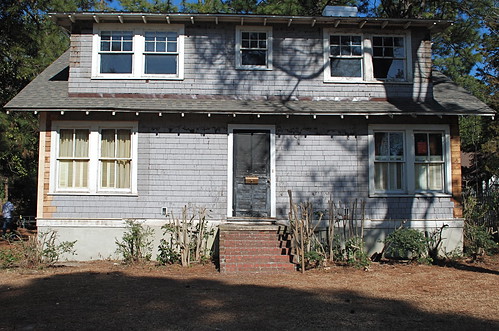
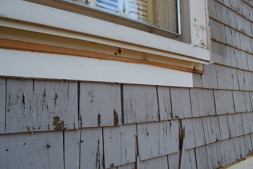
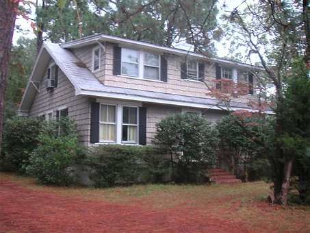
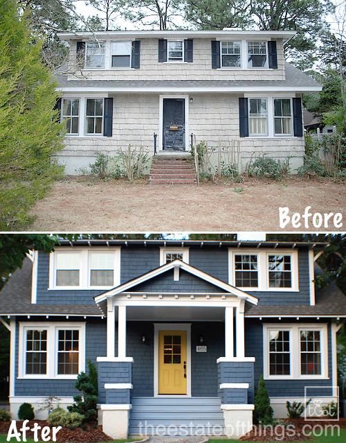
With all of the exterior painting done with the exception of deck stain and touch up, we turned to selecting an accent color for the front door.
After considering blue/grays, white, greens and gray (boring!) we gravitated towards red, deep coral or a gold.
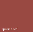
My Mom suggested the gold, both she and my Dad really like Benjamin Moore’s Goldfield. I like Spanish Red.

My goal here is to find a color that is both fun and sophisticated. I want to totally distance myself from the dreaded “whimsical”.
Samples are up,
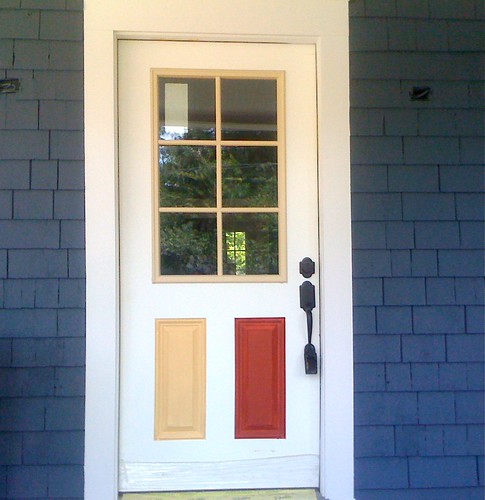
And your vote is?


goldfield, the red is so cliche.
I like the red, but then it starts to look very 4th of July whimsical. I’m going with the goldfield…..
I like them both – which surprises me … I thought there would be a clear winner.
Goldfield is my favorite, though.
Gold all the way.
I normally love red doors, but I think the gold and blue combo is gorgeous. Go for the gold!
My vote would be a slightly deeper version of the gold. I love red doors in general, but it’s a bit too patriotic for my taste with the other colors going on here.
Easy. Goldfield.
I’ve said from the beginning if this house is grey or blue the door needs to be yellow.
Besides, honestly, I really dislike that red.
Definitely gold. Who doesn’t love a red door? But it’s been done – a lot. Besides, Susan deserves to win this one. :)
We also considered Ben Moore’s Showtime, which is one shade deeper than Goldfield. Showtime appeared in House Beautiful’s 500 paint colors that subscribers should’ve received in the last 2 weeks.
I agree that the red might be a little patriotic, but I really don’t like that yellow. Maybe it’s the picture, but it’s reading very peachy-pink to me. Too much red in it, I guess. I do like the idea of a yellow door, though.
I like the idea of the gold door, but not really a fan of that particular color. What about combining the ideas of both colors and doing like a burnt orange? Not a color you see too much and I think it would really pop!
JGeb- we debated burnt orange and could never really settle on something we loved. Thanks for that suggestion!
I love the gold, but feel it’s been done (lately) enough to be called cliche. I’m still ok with that though. Betsy might be onto something with light blue and kelly green.
Light Blue or KellyLime Green…. !!
or Gold I guesssssssss!!!!
At first I liked the gold more – but now I’m leaning towards the Soanish Red (it has a nice orangish look in the photo of the painted door). Seems a little less cliche to me than the yellow (goes to show how opinions of what constitutes as cliche can vary!). Perhaps it’s b/c a blue and gold combo just makes me think of my alma mater, which leads me to imagine that the house would be decked out for a football game. Both the red and yellow do look very nice, though!
I think burnt orange or deep coral is about to make another appearance and enter the field of selection
Go for the red, the gold makes it look like the flag of Sweden.
ooOOoo Coral!