Bunny Williams’ contribution to the Kips Bay Decorator Show House did a lot for me in the way of inspiration.
Just when I started to have second thoughts about the turquoise and green color scheme in my living room these images appeared a couple of months ago. I just needed a little jump start.
Bunny Williams, Kips Bay House

This room has gotten tons of acclaim from the design industry but interestingly enough I read a post on a blog called Colour me Happy which didn’t totally agree with the color choices in Williams’ design. Colour me happy thought that the clean turquoise combined with the other “muddy” colors was a bad choice. Your thoughts on Bunny’s room.
Stephen Gambrel
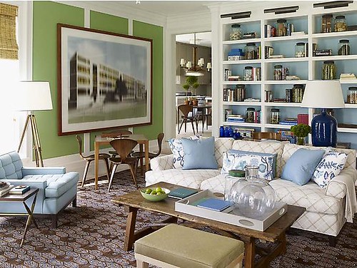
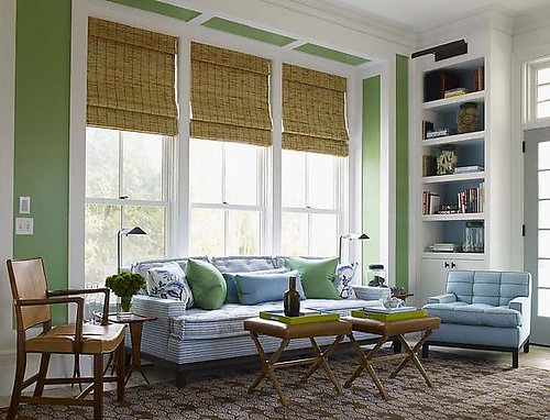
I realized after seeing these rooms that the green & blue combo with neutrals mixed in was still very much alive. I also realized that honey gold tones and wood tones were a pretty decent accent to throw on top. Like maybe this pillow for instance…

Â
Â

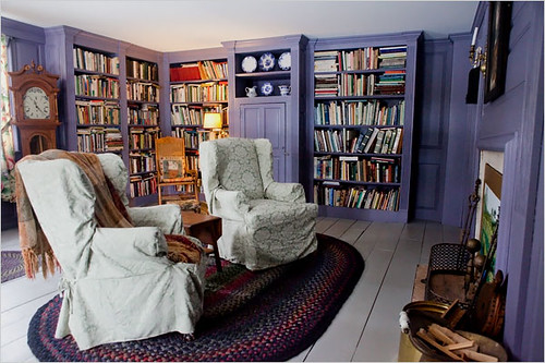
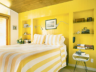


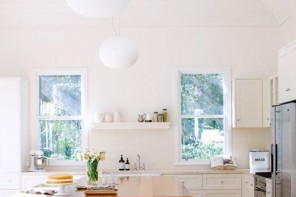
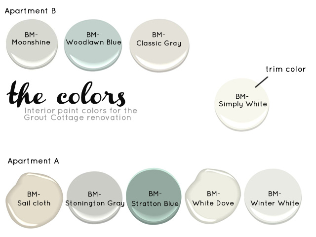
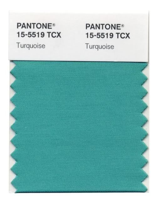
Oh I love these color combinations. It’s what I have tried to do in my own home, on a slightly muted scale. Lovely.
Oh, Bunny.
This room was the only room I remember from the last House Beautiful Mag that I picked up.
I have a feeling that without those two huge prints and the red egg chair… I may not have looked twice here. And then the color relationship in this room is blue and brown, and man do I remember when I got tired of everything being baby blue and brown.
However, my thoughts on green/blue are pretty positive.
I really love looking at the old green chalkboard hanging on my airy turquoise kitchen wall. And now that you say it, I think I like it especially b/c of the worn honey frame around the chalkboard.
Lots of people have gone ga-ga for the red egg chair and because it has no relevance to the rest of the room
Oh my, those walls in the first photo… perfection!