It’s been a while since I shared anything about the Spring Hill Project but that’s only because the kitchen renovation was delayed. Things are still happening just at a relatively slow pace.
Though recently, I put together a little gallery wall for the living area.
Since the beginning I thought that one of Jennifer Ament’s prints would be fitting for the space and the client’s style.
Here’s how I chose the artwork for the complimentary gallery wall.
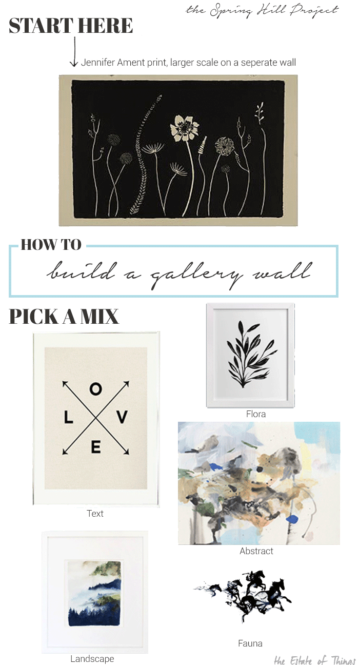
Art is subjective right but I wanted to bring in some elements that can be taken and translated in to your own combination of art. The key elements I used in this grouping are:
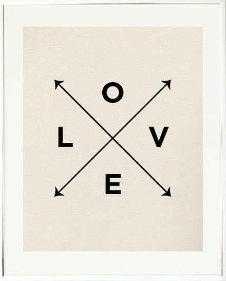
A print or work with words, a phrase or some kind of typeface,
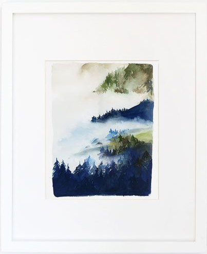
A landscape,
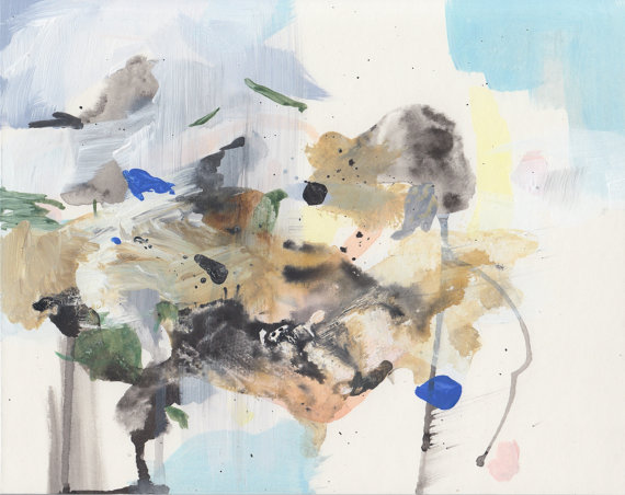
An abstract,
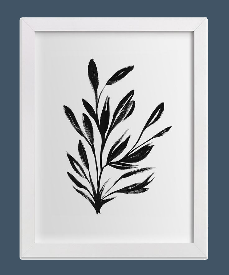
Flora in black and white,
Fauna in black and white,
And that made for a mix that we thought worked quite well with our jumping off point.
Thanks for playing,





Perfect combination Sarah. As always, your picks are DEAD on.
<3