So we saw it. And then I saw it again……… and guess what y’all…….!!!! We’re getting it. I just got a text message from Patterson that says “Thank you for believing in the now.”
Let’s take a tour. We are the Yellow door. Once inside, there is a fantastic little greeting area. The kitchen is immediately to right. I snapped a pic looking in from the front door, and then from the inside back towards the same door. This area makes a great little space for a mudroom type landing strip console welcome home area…….. with art (and a pocket door so your guests don’t have to peer into your kitchen first thing)!
Pass through the hallway, and it opens up into the living room at right. Pretty much the entire north facing side of the apartment is floor to ceiling window, except of course where it breaks here in the living room for a fireplace. Love the grid this creates, reminds of Piet Mondrian.
I’m digging the modern trim that runs the entire apartment at an unusual 7ft height, especially at the beams where it opens up over the hallway and kitchen.
The pocket doors really transform the living pattern throughout. Here is another huge one that leads from the living room to room #2. You can pull it closed for privacy when it’s bed time for bonzo. I heard from the people at Jim’s website that it’s relatively sound proof too. Oh. also, peep the patio view from room #1. The balcony runs the entire length of the apartment, and opens up at this end into a space large enough for dining.
Perched on one of the VERY FEW hills in Santa Monica — the view from the patio is retarded and I’m so in love. Every time I ever visit a home with a view, a little piece of me wonders if the folks that live there take it for granted.. I wonder, would I? Now I get to find out. Check this out, you can see just about every stretch of Santa Monica.
I love it heart and soul. And, since it reminds me of Piet Mondrian, maybe Joel’s primary color red couch will work with my yellow curtains after all? Should be interesting to see how the three of us shape the look of this place.
PS and BTW….. Sarah, I’m thinking heavily about getting into the TEOT Etsy store bizwax with you. I saw that you’ve sold over 80 items and you continue to keep it stocked with timeless and beautiful accessories. I know we’ve talked before, but let’s do it again. My finds may be a little weird when pictured next to your very High Street Market style. But, I’ve always enjoyed the juxtaposition of our tastes together!
Thanks for playing,











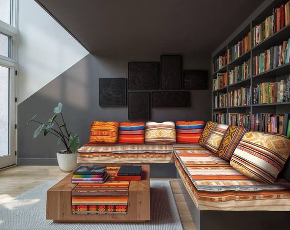
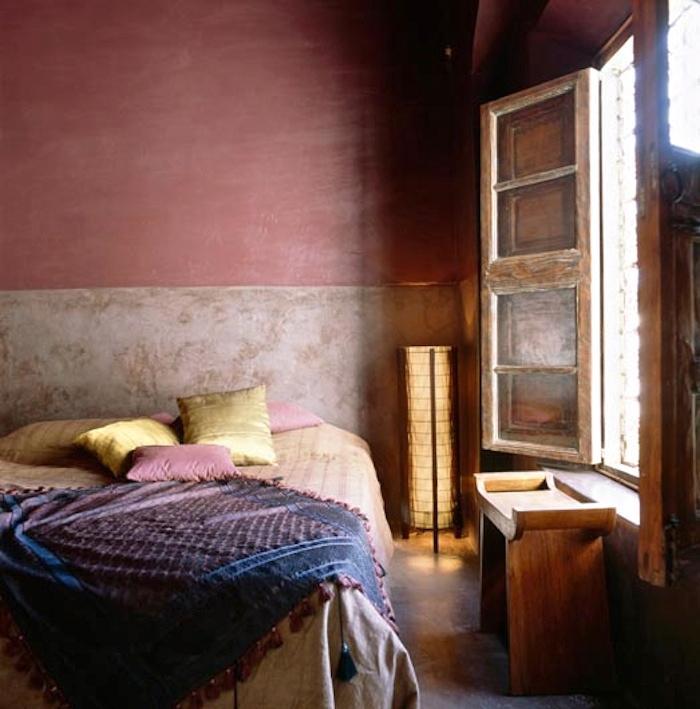
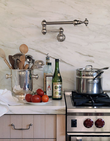
If you’re thinking primary colors—its a good time to look at the work of Miles Redd. Excited for you three!