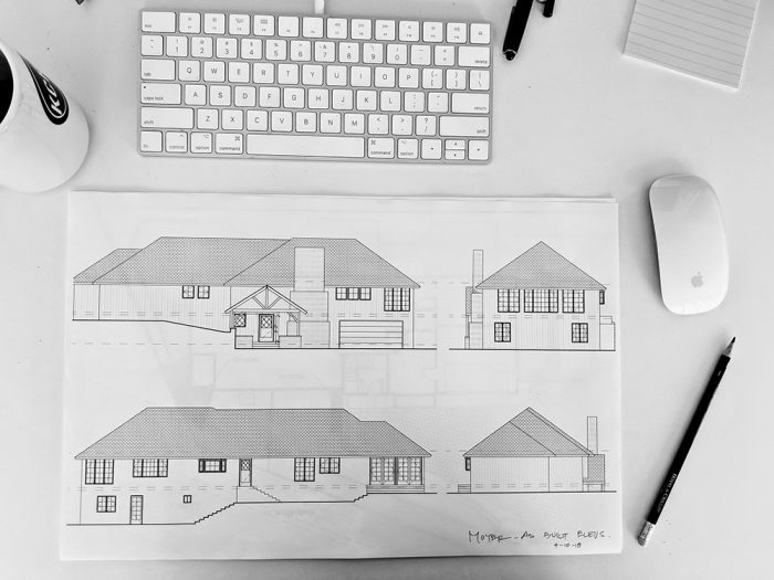
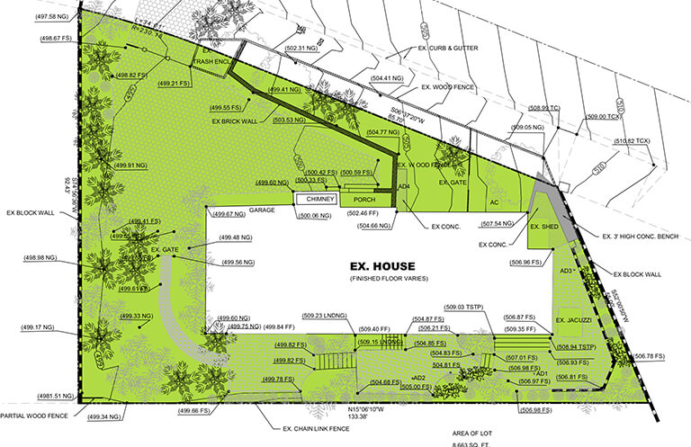
AutoCad rendering showing the slope of our home as-is.
Yay, the architect came by. We had so much fun.
Nita is what I want to be when I grow up. Or at least I want to be someone that works with architects. I loved her drawings, her math, her logic and her problem solving.
I won’t go into every detail of the two hour meeting, but I will share the highlights, and I’d love to hear your thoughts. We have options and construction costs to consider, and thus more drawings to come. But this is a great starting place.
So, just a quick recap. The dude and I are expecting a baby and our current layout is a 3br. Jeff and I take up the master suite in our current layout and each of the 2 kids have a bedroom in the main living space. A floor below, in our split level ranch, there is a garage, studio and storage cellar. The idea is to convert that entire space into livable area with 2 more bedrooms. We’re looking to add-on a new garage with a deck on top.
In the last post, we talked about timelines and the confusion of bureaucracy. I’ll keep this part short cause probably, “who cares.” But we’re on a canyon slope in a coastal zone which affects the percentage of floor space our structure can take up in the total square footage of our lot. But there are all these bonuses and caveats and we scored a nice 35% amount, which allows us to add on up to approximately 512 sq feet. That gets us the *almost 20×25 foot garage we need!
So yeah, snoozefest but I just want you to know that we got it and that’s a green light and so that is a relief.
Next up in bureaucracy land is the geotechnical survey. I’ll spare you the details for now. Let’s get to the fun stuff! The designs!
Here is the 1st layout we looked over.
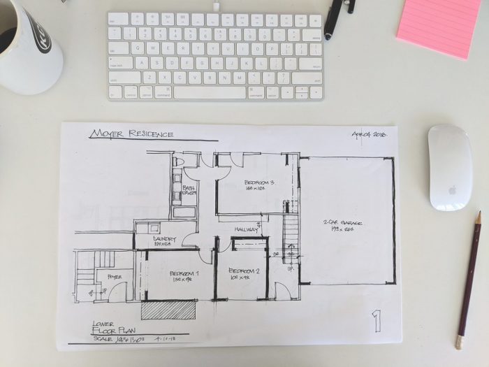
Of note with this design plan: One, I miscommunicated and the architect planned for 3 bedrooms. I didn’t correct her immediately upon review, she had a huge stack of paper to work through with me plus Bedroom #3 could easily be used as a den/living area. I didn’t want to poop on her immediately.
But I slightly panicked on the inside when I realized that there was no room left in the design plan for Heffe’s home brew and beer storage.
More importantly than the room layout though – Plan #1 accommodates a reimagined entry for the home and includes a small foyer with a staircase leading directly up to our current sunroom.
This plan was particularly fun b/c it came along with an exterior rendering.
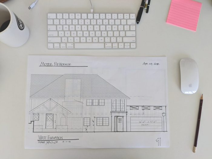
An illustration of what a second entry could look like on the face.
My immediate reaction to this was really positive. It’s a nice modern addition to the current style of our home.
Side note, I often look at our house and think that it would be really easy to translate into the East Coast inspired modern farmhouse vibes that are popping up all over the Palisades & Santa Monica right now. You know the look, aluminum roof, black trims and window frames, white board & batten siding, gooseneck sconces.
Plans 2 & 3 eliminate the need for the second stair/entry and assume that we can modify the existing stair/entry after all. This is ultimately to be determined, but according to AutoCad measurements, its all feasible. We’ll have to have the contractor out to confirm.
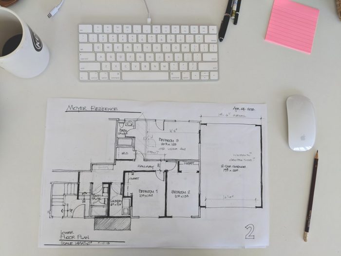
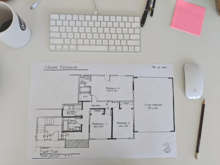
If you care to scrutinize you can see that the difference between 2 & 3 is in the location of the access point from our current entry. It also scores us a second bath (which would total 4.5 for the home and is completely unnecessary).
Also, we’re still missing room for Jeff’s home brew room in all 3 of these.
But going through the plans and hearing Nita out helped me to peacefully communicate my desire for that 3rd bedroom to be treated a bit more like an open living area. I think she did an incredible job of carving out those rooms with great flow, but it was a lot of unnecessary hallway if we eliminate the 3rd bedroom. Once we started talking about opening up that space, (You can maybe make out her pencil edits on Plan 2) it also gave me an opportunity to express the preference for putting the kids in bedrooms on the back yard side of the home.
So, she pulled out her vellum and we reworked it together and it was the most fun creative collaboration I’ve done in some time.
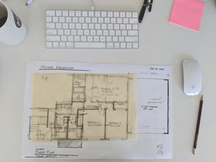
This is what we came up with which is not at all easy to decipher. Since its the chosen layout, I’ve taken it into photoshop and cleaned it up a bit for you below. She will be reworking the drawings on her end, and she will work on the exterior to accommodate our choices there.
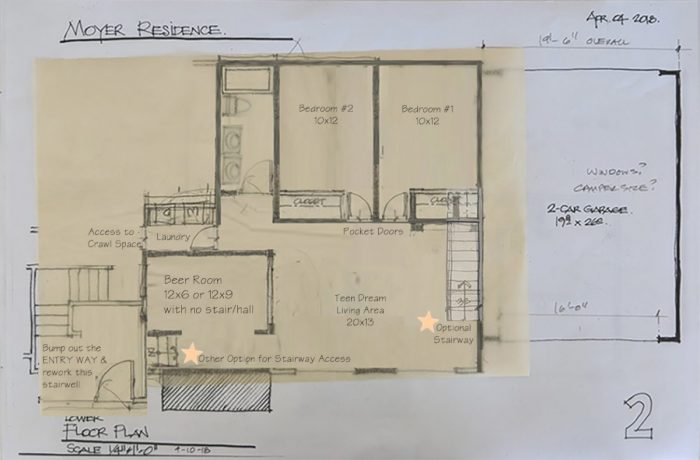
WINNER WINNNER!
So, that’s the winner. This layout satisfies all of our needs and leaves us with choices/options if the stairwell & entryways limit our preference. In this plan, the stair works either way.
The whole two stair / new entry decision is going to boil down to construction feasibility, costs and budget. We will need the contractor to assign some dollars to each option. But at the moment, Heffe is leaning towards the smaller home brew room in favor of just one set of stairs, which will also leave us an uninterrupted sunroom upstairs. I’m with him on that.
Having a second exterior entry at the second stair is optional as its not necessary. We already have a front door, even if it is tucked away a bit. Nita and I discussed the possibility of gaining some room in our current entry by enclosing the covered porch and reworking the old face of the home a bit. She is going to work that up, and it should make more sense once she draws it out.
Perhaps the next exciting little piece of the puzzle will include a look exterior possibilities!
I do love following along on your progress!! This is so exciting!!
Thanks Amy! I’m excited too. Wish I coul speed things up for instant gratification. Love you.