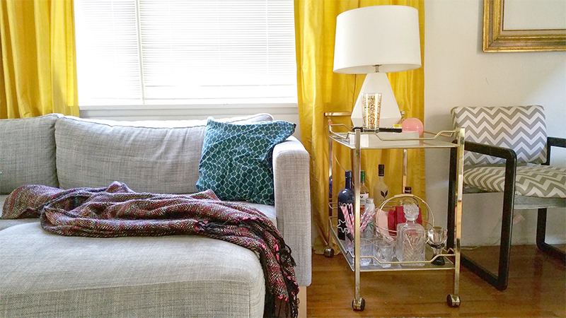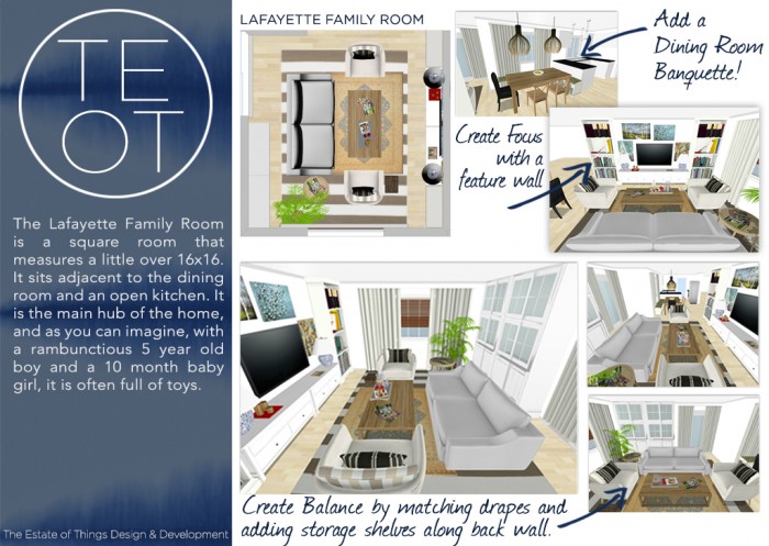
Y’all remember way back to yesterday when we were chatting about the Lafayette Family Room.
Well, thanks for bearing with us, while we set up what we’re getting into. Now, let’s jump into our solutions for the space plan. We took the scenic route, considering (and spending lots of time mapping out options.)
Here is where we landed.
FURNITURE & TELEVISION PLACEMENT
We sought to solve the space plan woes for the family by floating the seating pit in the middle of the room.
Starting with the existing striped 10×14 rug as our anchor, we centered it in the room, just below the window. We suggest extending the curtains to 120″ to help frame the seating area, though the window is only 96″ wide. We then suggest floating the furniture inside that 120″ area.
Consider a vintage kilim rug layered on top for added texture and visual interest. Our renderings are a loose interpretation of our ideas for placement.
- We suggest centering the layered rug according to the final sofa & coffee table dimensions.
- These dimensions are all affected by one another, but ideally the coffee table should be centered over the rug, positioned roughly 16-18″ away from each seat, (Note the large gap in the former arrangement.)
- Whether on or off, the rug should ideally have the front legs of each furniture piece equidistant from the rug’s edge. We suggest on.
There should always be a flat surface within reach of every seat, so the homeowner’s existing mix of side tables should serve perfectly once mixed in with the new seating layout.

| A PROBLEM | A SOLUTION |
|
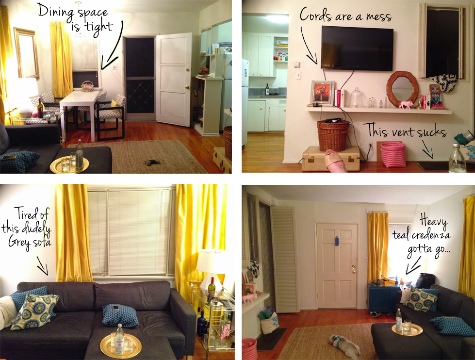
We did discuss some apprehension over the TV becoming the main focus in the room. There really were only two options for placement and the homeowner had tried both. Of the two, the one pictured in our before image above was not working functionally, while centering it on the other wall gave it too much prominence. |
Our solution instead, is to create a larger focus that the TV can be a part of. By grouping the wall-mounted device among the art gallery scenario, and flanking it by two floor to ceiling shelving units, along with a low profile console (all in white) the entire wall becomes a showpiece. |
MOVING ON TO OTHER TO DOS!

ADD A DINING ROOM BANQUETTE
We couldn’t help ourselves, and so we pushed beyond the boundary of the family room a bit. One of the casualties of the former space included the dining table encroaching into the family room zone. We love us a good dining banquette, so we tossed it into the floor plan just to see. We love it.
- An appropriately sized bench or a built in banquette under the window will create a fantastic feature that is both on trend plus will help maximize space between the rooms.
- We do suggest considering a statement pendant for above the dining table, but consideration of the proximity to the kitchen peninsula pendants is important.
“Watch out it doesn’t turn into pendant city.” - We noticed the homeowner’s peninsula countertop has a rather large lip unlike our rendering. Our suggestion is avoid placing bench seating below, but a customized built in could accommodate.

CREATE FOCUS
- Make the TV part of a gallery wall to take the focus off of the device itself
- Center a low and long console, then flank with floor to ceiling bookshelves
- Style with existing matching lamps or spring for new lamps in a more petite, traditional shape
- We think you might even be able to camouflage the large speakers among this setup.

CREATE BALANCE & COHESION
- Float the rug and furniture in the middle of the room
- Match the 3 window dressings between rooms
- Create a storage feature along the back wall to help balance the weight of the TV focus wall
| A PROBLEM | A SOLUTION |
|
The homeowner had doubts about hanging the drapery.
|
We think she had the height and the width right for the hardware, but would benefit from a bit more length in the drape itself. They should kiss the floor, rather than hang a couple of inches above
|
|
We also noted that the sliding glass door on the adjacent wall appears bare in comparison, while the dining room window in the next room was another disparate pattern, making the spaces feel disjointed.
|
Matching floor to ceiling drapes on all three windows will create a more cohesive look, tying the spaces together.
The grass shade can be eliminated for the sake of functionality on the sliding glass door, but is present on the two windows. Push all drapes to the left for easy access in and out of doors. |
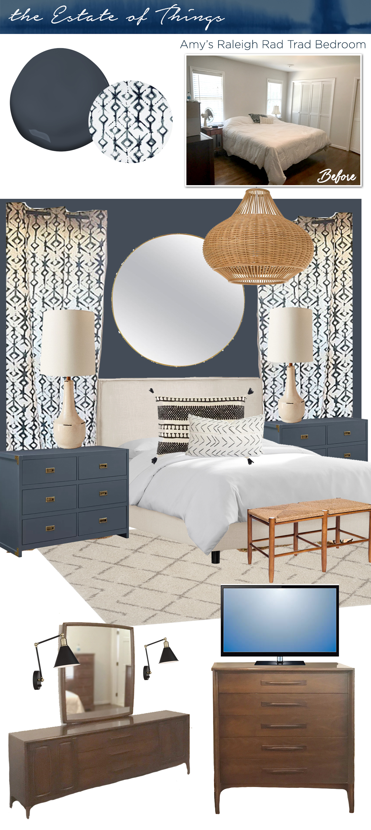
Sarah and I recently introduced E-Decor & Historic Renovation Consultation Services to SHOP TEOT.
We have been doing this type of work over the years, typically working for an hourly rate. We live for these kinds of projects. Designing and Decorating, solving problems, tying your style with our strategies for a timeless style with modern appeal makes us HAPPY! Check out our services here, and let us know if you see any opportunities that we should consider adding.Thanks for playing,


And now a quick word from our sponsors!
SHOP OUR VIBES: