Lately I feel like I’ve been in a perpetual state of paint color selection.
It was time to begin the color selection process for the Connecticut Avenue Duplex project. You might recall we’re giving a rancher a Venice Beach bungalow inspired facelift. I knew I wanted to go dark because the trim work and arbor we’re adding to the front will really stand out on the dark house. Set that dark house and white trim up with some more green in the landscape and maybe a white flower here and there and we’ll have a solid outcome.
Here are the lead off colors (all Benjamin Moore),
In this image, we’re looking at these colors in the harsh morning sun in a spot on the house that gets the most direct light. The reason I put the samples up here is to ensure that I choose a color that has enough substance to stand up to direct sun exposure. I’m looking for a charcoal that has a navy cast at times. So far, French Beret is out. What’s your feeling here?
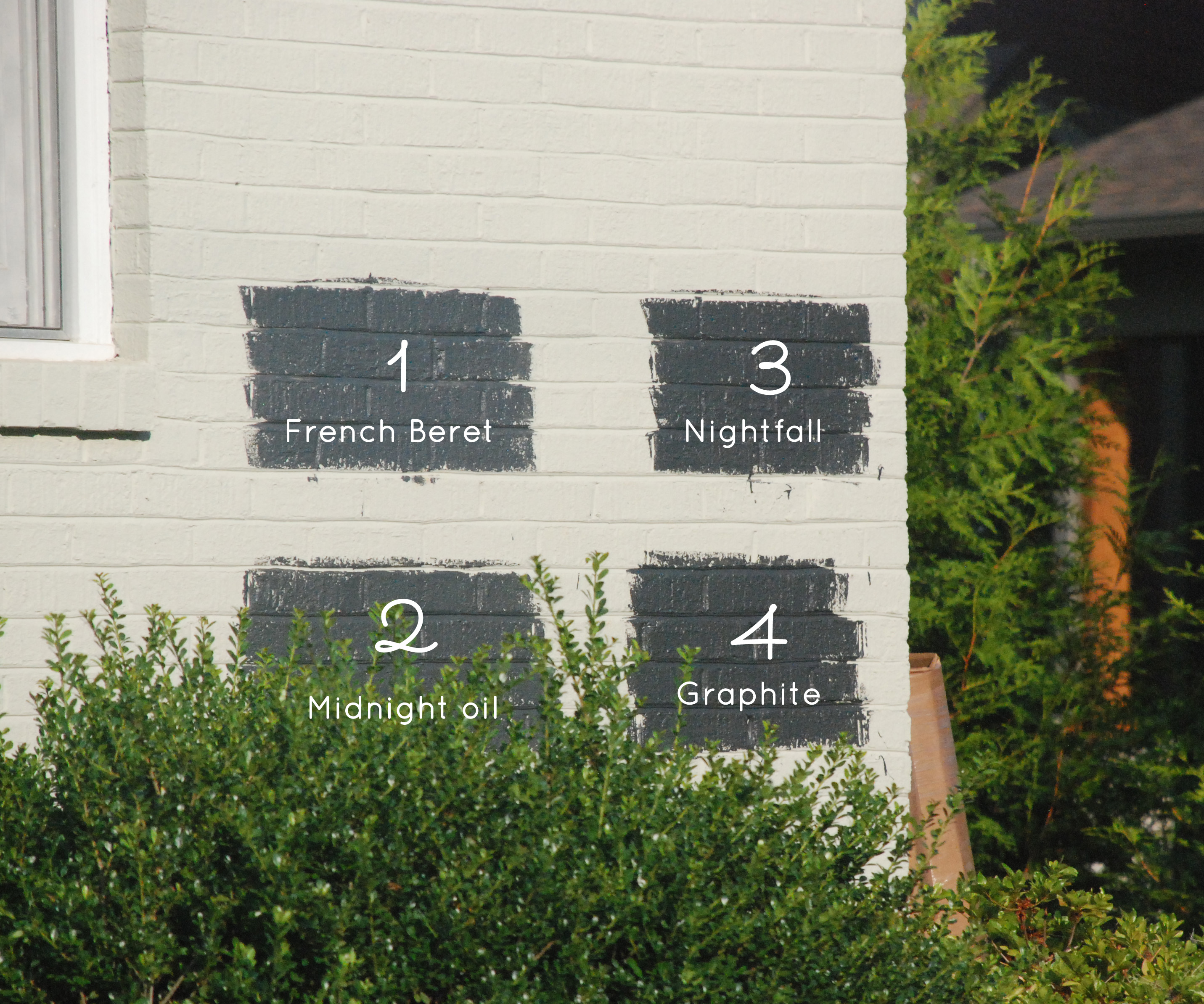


NIghtfall!
Leaning towards Midnight Oil, but bouncing back and forth b/w Nightfall and MO.
Hi Sarah! Not sure if it’s too late but I love Graphite, and then my second choice is Nightfall. Graphite will make more of a statment and has the blue look you wanted.
Geez Connor-I’ve almost ruled Graphite out. It’s really a solid, substantive charcoal though but it doesn’t have as much of that blue that I need like Nightfall and Midnight Oil.