Hi. It’s Sarah. We’re going to take a quick dip into a residential Design & Development project I’ve been working on.
The Dogwood Project is a modest 1960’s ranch located in Durham, NC. A college professor and her family live part-time in this home while school is in session, and the rest of the time, they spend in their New York abode. We would describe the homeowner’s style as a collision of modern, eclectic and global.
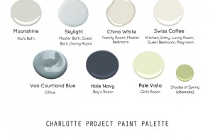
Since the beginning of the Dogwood Project, I have been operating in an official capacity to consult on new paint colors throughout the home. The client loved the color selection at the Durham project and so they emailed for our input. She wanted to freshen up the paint job in her 1960s home which we did happily.
After the success of the paint color consultation, the project has evolved. Now, we are re-thinking the master bedroom space plan and decor. Here is a look at where she started.
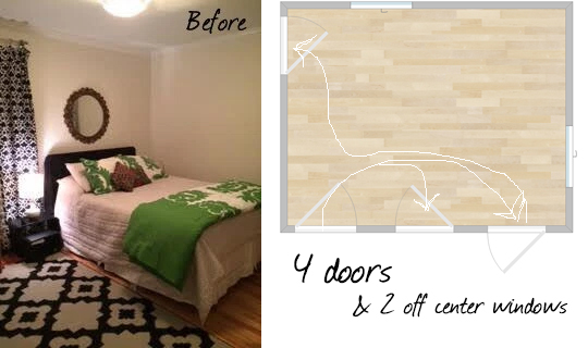
The client was seeking expert advice on the room layout, and we could see why, as the room certainly had challenges.
[columns_row width=”half”]
[column]
The Problem
Each wall in this small room is occupied with a challenging door or window, leaving limited options for bed placement. Additionally, equally distributed bold patterns are competing for attention in the room.
[/column]
[column]
The Solution
Our goal is to make the bed more commanding in the room. Despite the window position, we can achieve the desired result by shifting the bed to the left, closer to the window and then re-distribute the horizontal space with neutral drapes and a large scale piece of art.
[/column]
[/columns_row]
While intuitively the thought is to center the bed between the window and the wall, what we hope to do is create a feature out of the bed, and tricking the eye as to where visual weight belongs, for a new balance.
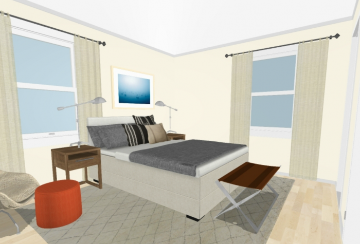
We mocked up the change as a rendering before we suggested it. This is a good practice when you can’t be in the space yourself or if you need your client to envision your ideas before making the change.
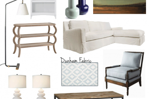
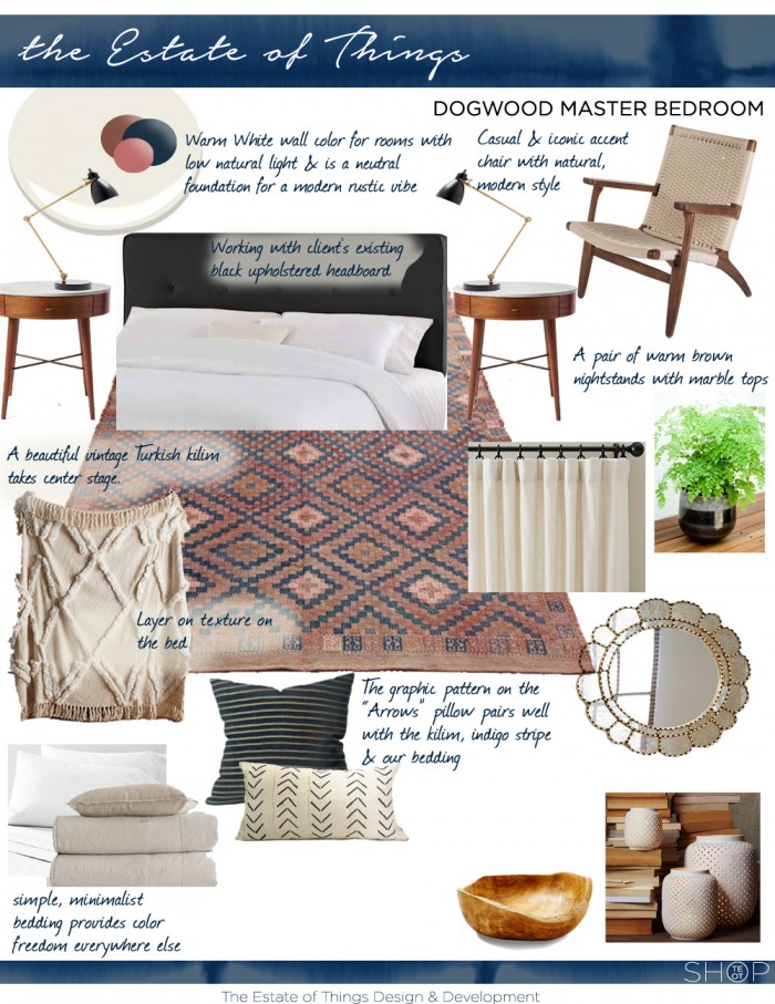
The client and I wanted to maintain a modern aesthetic with some added layers and texture. I utilized some existing elements that they already had like this wonderful Anthropologie throw, and I suggested some new additions as seen in the design board below.
We sought to redistribute pattern throughout the room for greater balance in the scale from neutral to busy. The client operates on a no shade philosophy in their household so the recommended natural shades were cut and instead we found a quiet cream linen curtain option. We kept the bedding and drapes neutral as well, which allows the rug, art and accessories to pop, maintaining focus in the room.
Here’s the plan,
We love working with the Dogwood clients because they give proper but quick consideration to our suggestions but most importantly they are willing to try out our ideas.
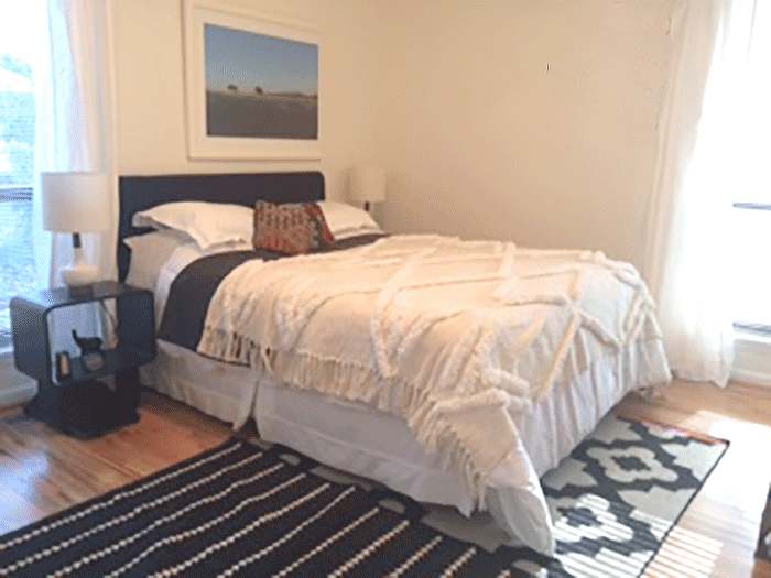
You can see below that the lighter curtain, the artwork and bed positioning have already made an impact on the layout.
Once we get the right rug placed on the floor, it will really ground the new composition of this room.
Also, I think we will adjust the artwork slightly more toward the window and we’d love to see more prominent lamps and matching end tables that bring more warmth, texture and a modern appeal to the room. All in all these minimal changes have made a vast improvement to the room.
 Thanks for playing,


