This week Betsy and I took a little time off from the store and met with our one and only local Southern Pines real estate agent Sarah O’Brien and viewed a gem.
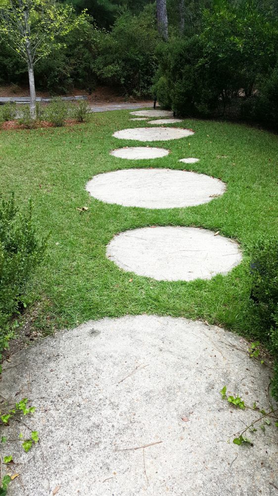
Modern round stones lead to this dreamboat.
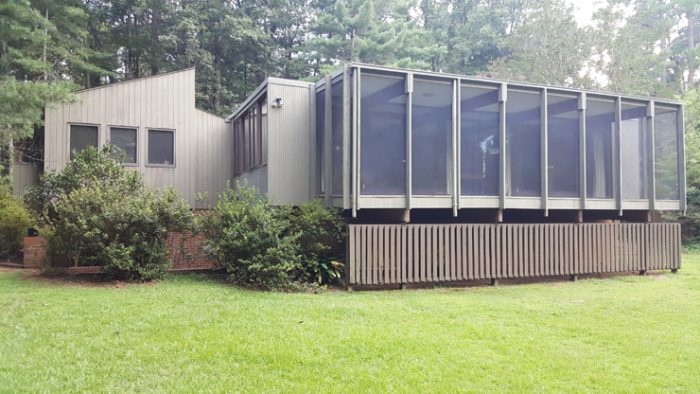
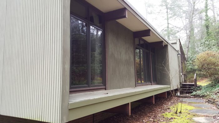
Designed by FAIA Architect Thomas T. Hayes Jr. for his family in 1958. Minimalist on the exterior and painted a deep pine green, the house folds in to the landscape of longleaf pines.
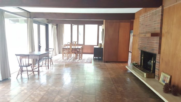
The main floor plan is fantastic and open in the way that we want to live today. The first highlight of the tour comes rounding the corner in to the living room.
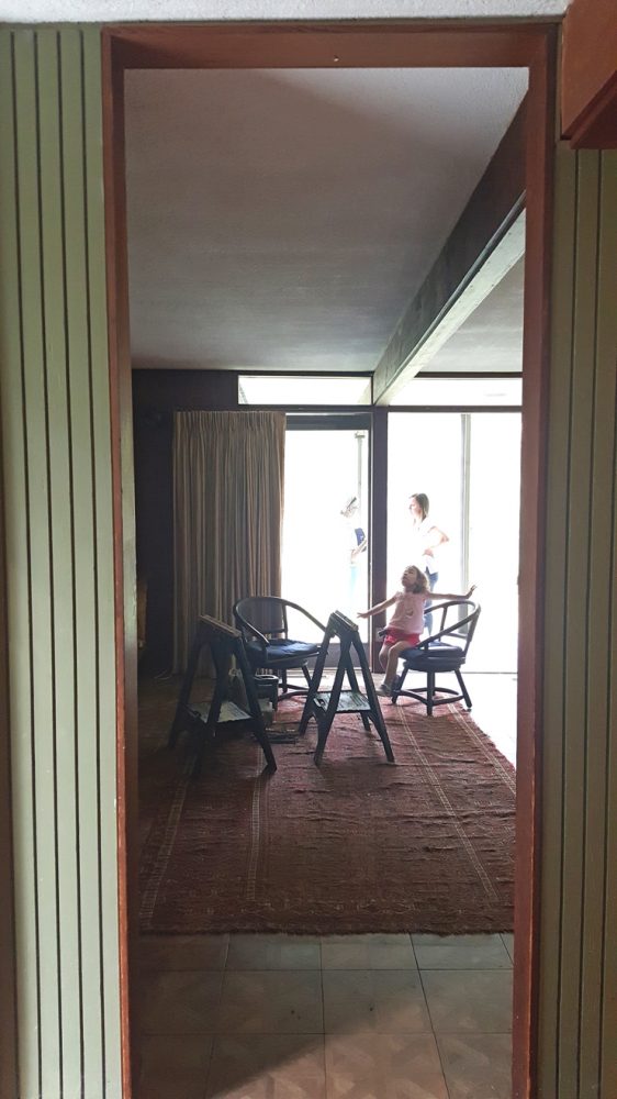
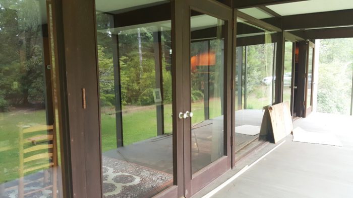
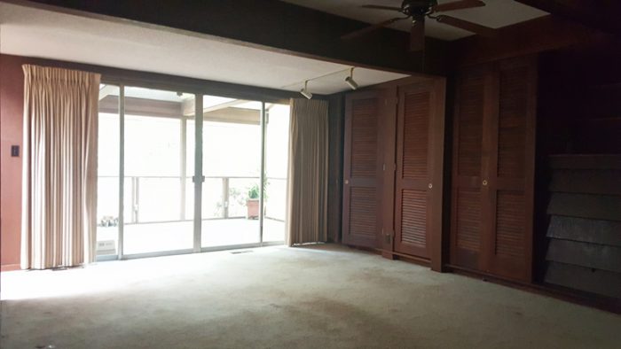
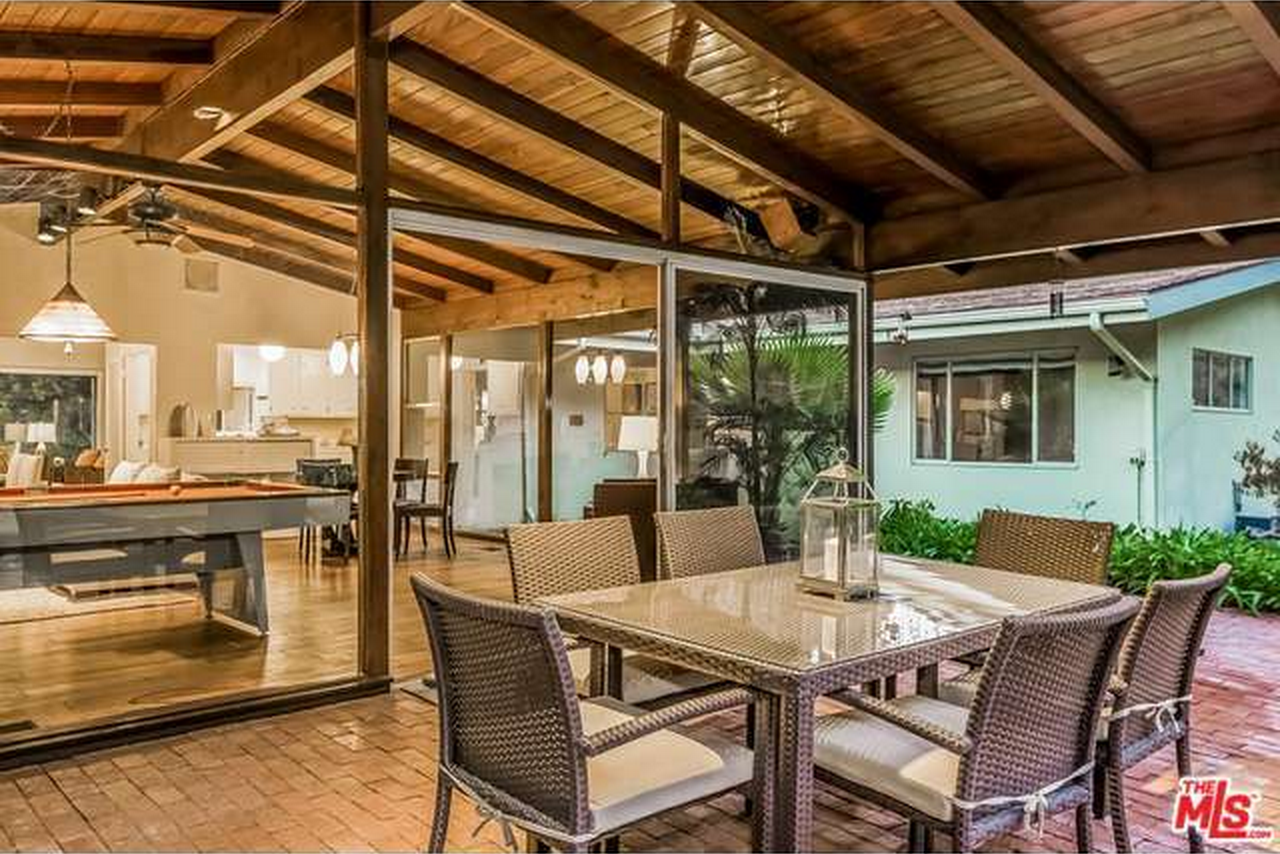
The living room has a wall with full glass and a pretty view on to the best part of the lot, which is 1.14 acres. Sitting or standing in the living room you get the sensation that you are floating over the grass and you can’t deny that is pretty special.
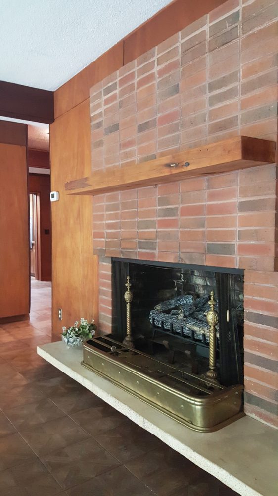
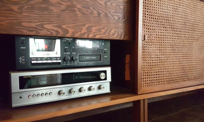
The end wall in the living area is occupied by built-ins to house media, toys– they can handle whatever it is that you need to stow with ease. The interior wall in the living area is occupied by a large brick fireplace with a floating stone hearth and a modern slab mantle that is installed in 85% of home renovations today.
Sliding closure of bottom part of built-ins,
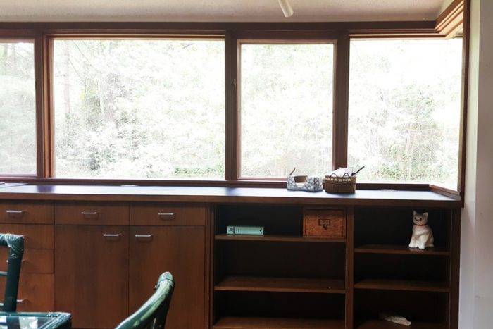
The living area is open to the dining area which grabs part of the glass view from the wall of windows.
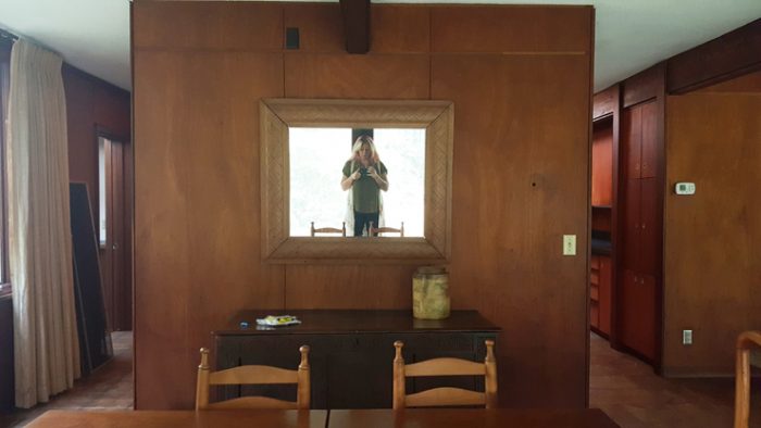
Shimmy around the free-standing dining room wall and you find what can be described as a bar and entertaining area where you can mix up a pitcher of martini’s, store dinnerware and serving pieces. I saw Betty Draper standing there pouring cocktails.
You could eliminate the wall between this bar area and the dining area and make a more expansive dining room and sitting area space. The bar area itself is still large enough to put a small table. Are we having fun yet? Clearly I am.
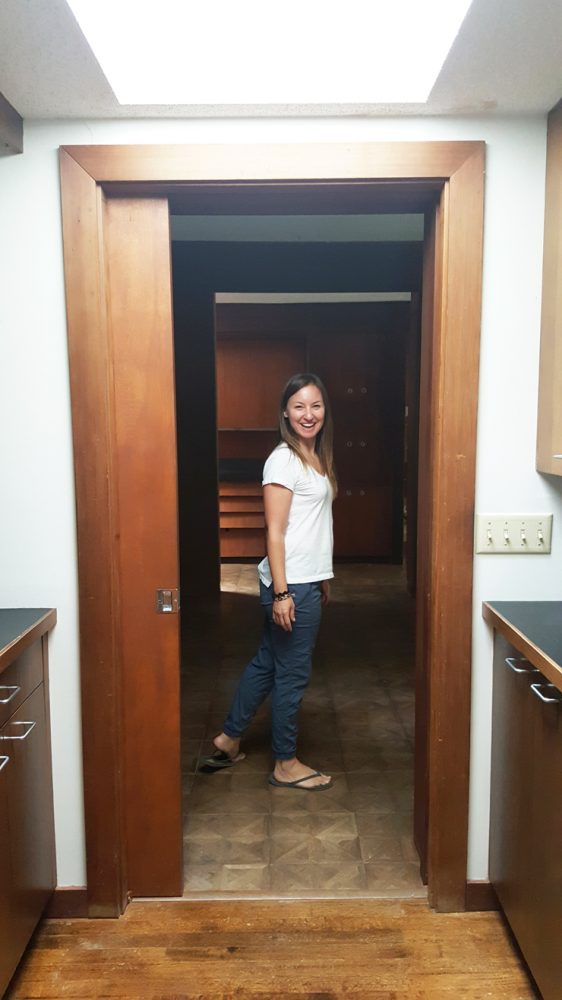
From the bar we head in to a butler’s pantry with a large and original wall oven and paneled sub zero fridge with more storage space.
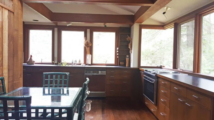
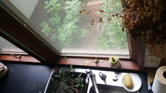
And then the second highlight of the tour is a very special kitchen that fell right from the pages of Dwell magazine. There are no upper cabinets in here, a very happening trend and it’s almost entirely glass from counter level up. The appliances are original except for maybe the dishwasher added in the 1980s and the sub zero likely replaced an even older fridge. You have a down draft slide in range with a small oven for daily casseroles, laminate countertops, original cabinets and wood flooring and the potential is seemingly infinite.
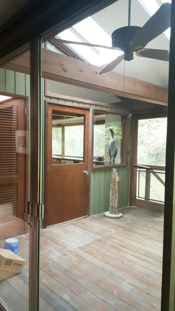
There’s a breakfast nook and a screened porch that adjoins the master bedroom and kitchen that was added in the 1980s.
So we’re drooling now walking out of the kitchen and we go to the bedrooms. There are three on the main level, a master suite and two smaller bedrooms.
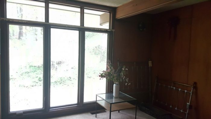
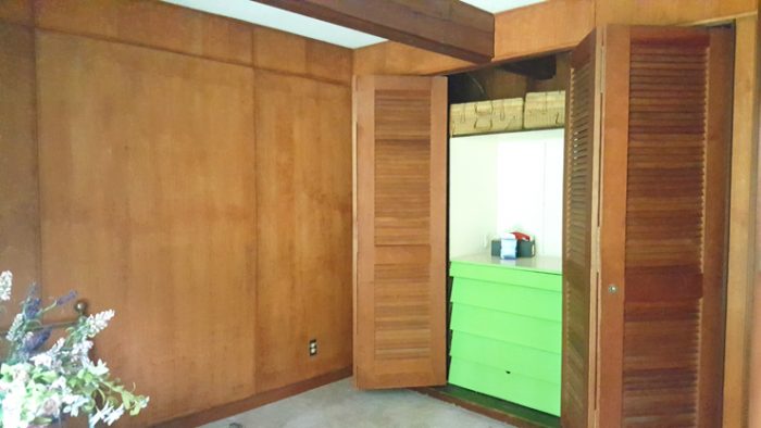
The master has a wall dedicated to built-in storage and it’s good size and it gives you a good starting point. Remove the carpet, update the lighting, paint the walls, replace doors leading on to screened porch and spruce up the built-ins a bit.
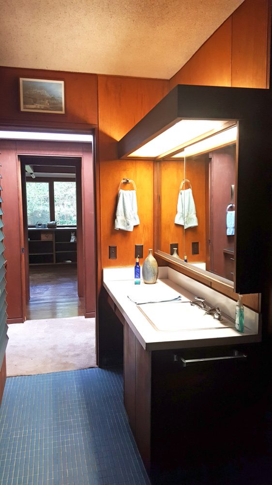
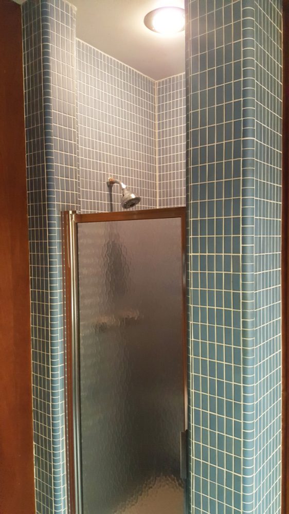
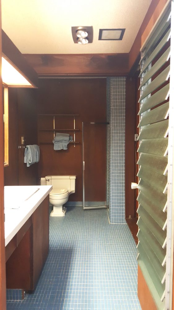
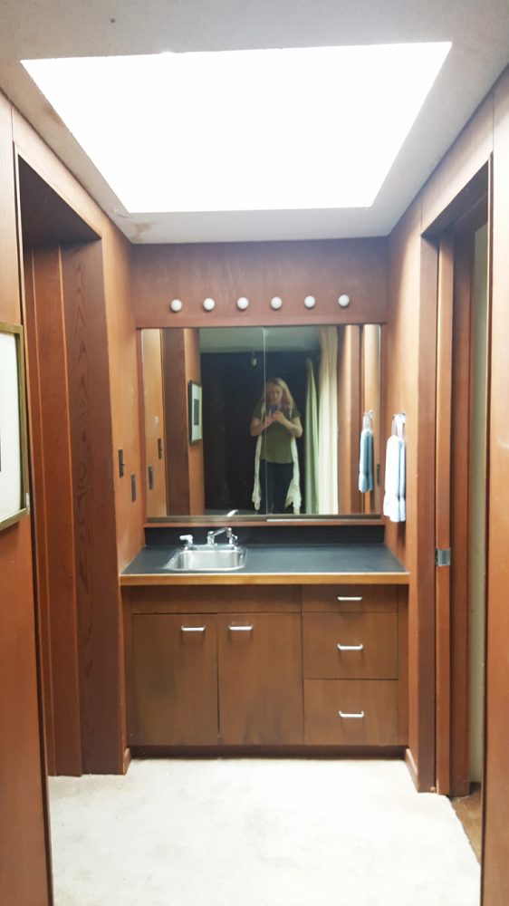
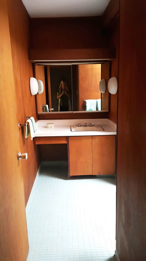
The master bathroom is fun from a novelty perspective but it needs to be re-worked. Larger vanity, new tile, shower expansion, lighting, paint and elimination of the hotel sink. Somewhere in between the master bathroom and the tiny kitchen pantry there’s a laundry space in there.
Hotel sink,
Two smaller bedrooms need carpet removal, paint, lighting and a spruce up in the closets but they are perfect for kids or guests. They each have a triple set of casement windows.
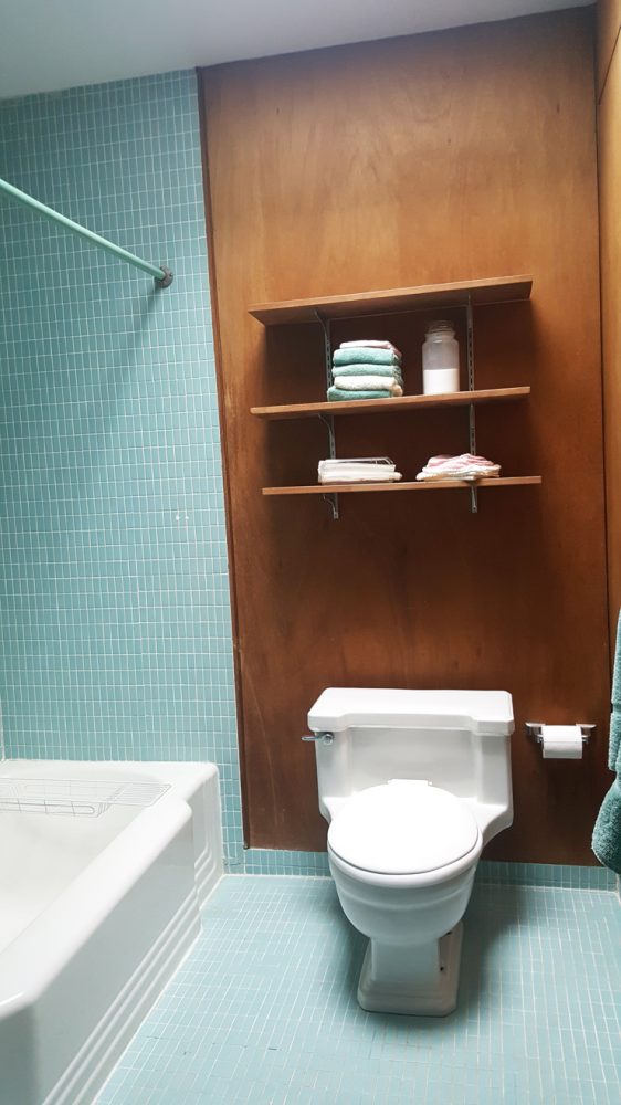
The hall bath that the two kids/guest rooms use needs some updating but doesn’t need a plumbing move, meaning the layout can stay which saves some money.
Here’s something worth mentioning there are two sets of hall closets amping the storage even more. There is major storage in this house.
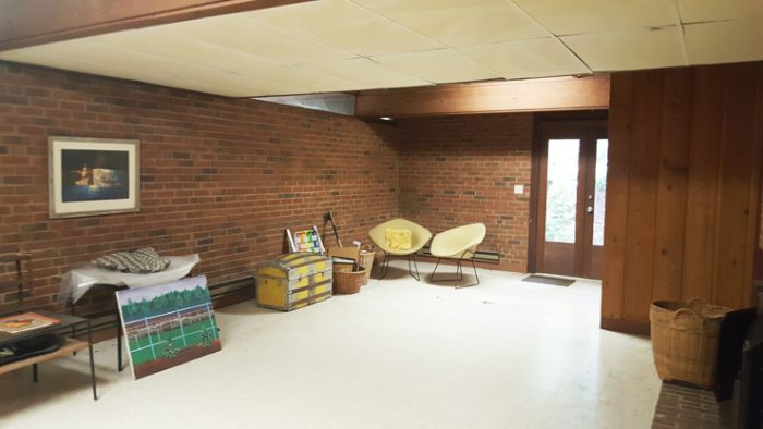
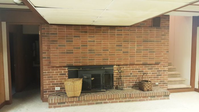
Let’s head downstairs to the basement which is partially finished and is a walkout. I think we were a little surprised that the basement wasn’t more finished than it was. The basement has a large living area with another fireplace and french doors on to a patio that desperately wants to be a beautiful zen garden with some sort of water happening there.
The floors are concrete down here and there is one additional bedroom and tiny bathroom down here. They feel a bit dank and slightly raw so you would need to invest some money down here, allowing more light in and putting some different flooring down and changing the finishes and of course beautifying that little patio which by the way, the guest bedroom has its own little view of that patio as well.
The mechanicals are down here as well as the laundry which I think needs to be relocated upstairs.
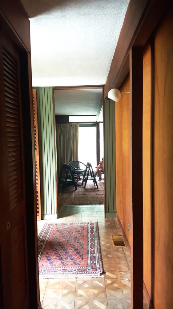
Walk the grounds and realize that the house is cantilevered over the foundation on large beams, that its private and quiet, in a great neighborhood and that a little trimming and some landscape addition and this place could be absolutely amazing! I know you see a lot of brown and dark corridors but fresh white paint goes a long way and some finish upgrades, we’re in business.
Love this house but have no idea where to start? Call or write to us we’d love to consult, learn more about our Design Services.
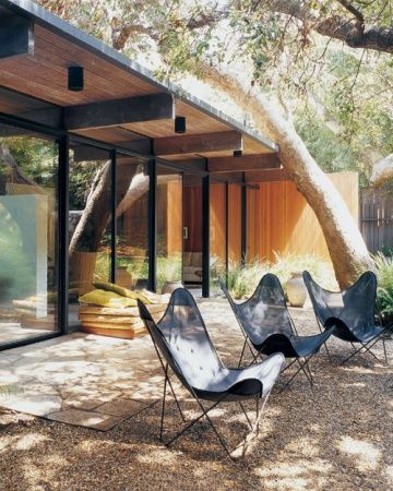
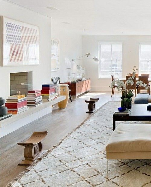
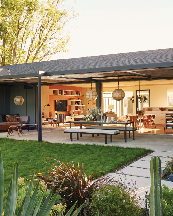
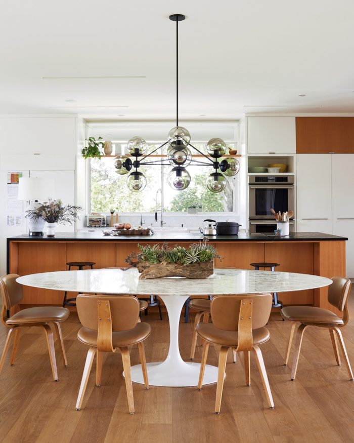
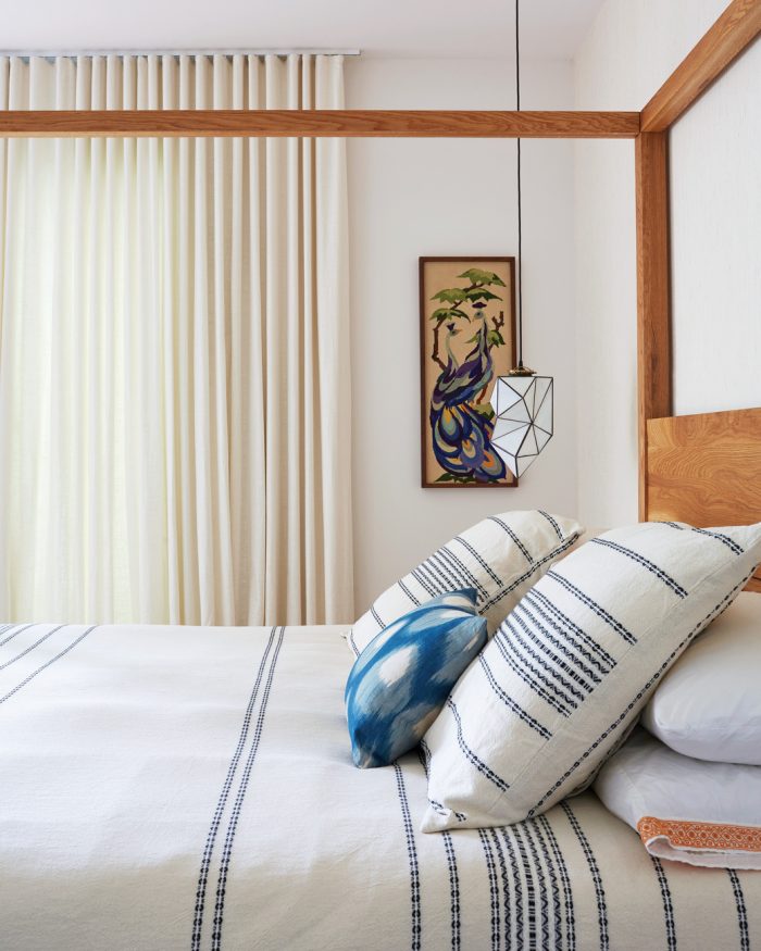
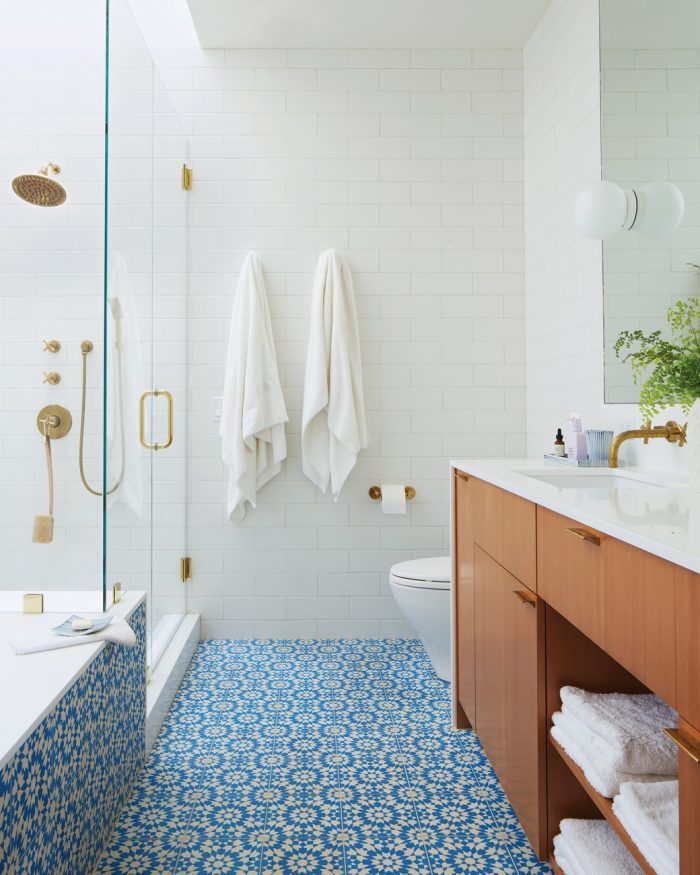
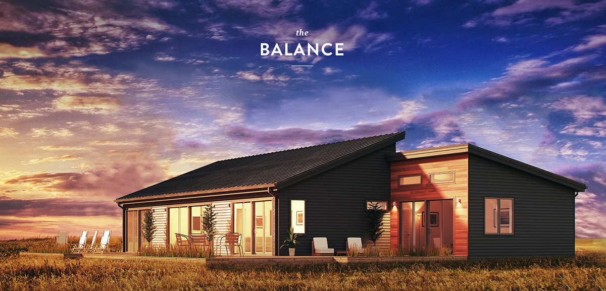
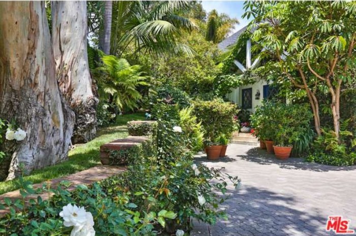
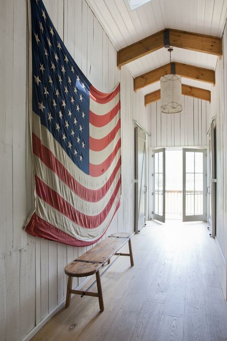
Modern is not cold and it’s not the Jetsons I can assure you of that. It’s eclectic, functional and collected. Here’s a bit of inspiration of what the Hayes home could be-
Note floating stone bench at hearth,
One of my favorite bits of inspiration was this LA ranch feature from the June issue of Martha Stewart Living.
Thanks for playing,






I’m obsessed with modern homes!!! Love this one so much!
So do we Jill! and this one is pretty exceptional and such a gem hidden in Southern Pines