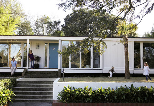
Jesse Carrier designed The Glass House Fit For A Family in the August issue of Elle Decor.
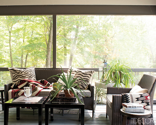
I have fallen hard for this house. This house has a great mix of styles and a sense of youthfulness. I think it embodies a lot of what the preferred style of most is today which is– a space that has a sense of personality, is livable, functional and at the same time presents a sense of history or tells a story about the people that dwell there. I read a decent amount of design blogs everyday and I feel like the overall aesthetic represented in this home is what most design pundits are yapping about, including myself.
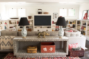
The Fielden home manages to read modern, casual and liveable for three kids yet houses a French provincial dining table, Chinese porcelain panels and a Chippendale-style breakfront.
Jesse Carrier knocks it out of the park, again. When the couple wants to incorporate family heirlooms that have little relevancy to the architectural style of the house, Carrier edits but manages to incorporate a lot of their family’s inherited treasures.
How much did you love it, a little or a lot? Perhaps you didn’t?
Thanks for playing,

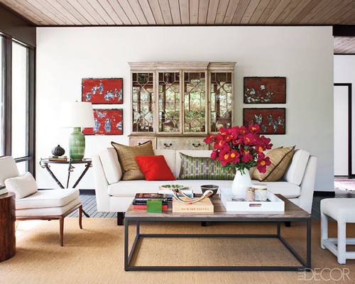
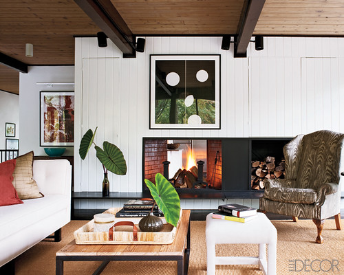
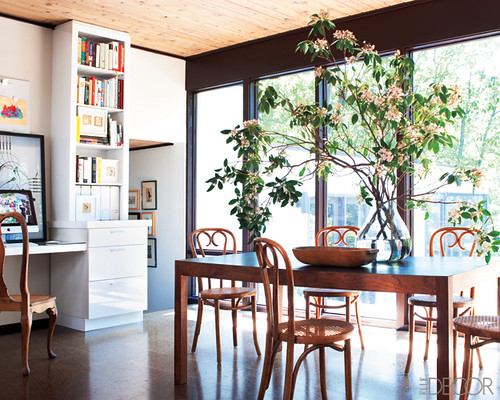

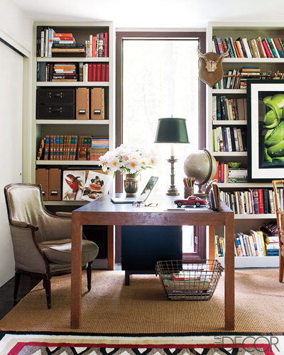
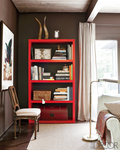
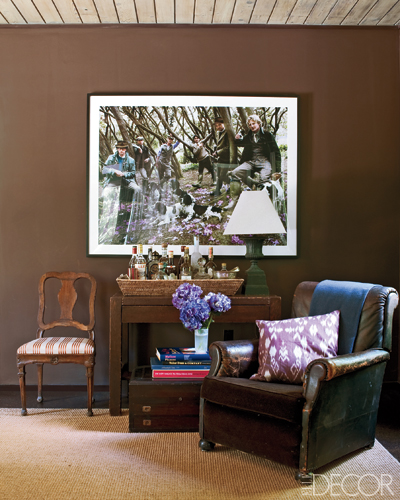
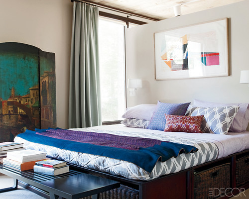
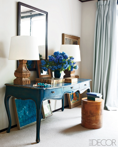
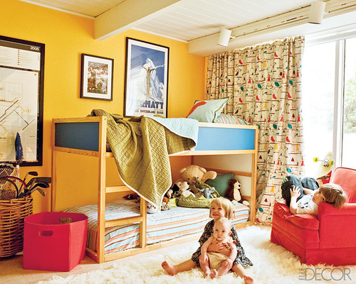

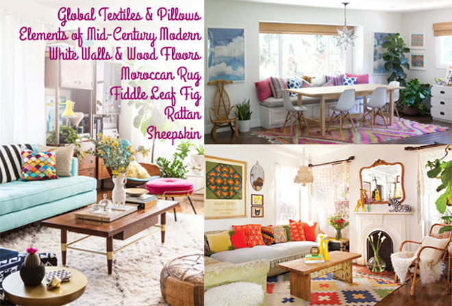

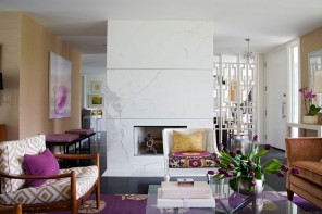
Oh I loved the hell out of that! Red on brown, that lilac in the photo on the brown wall, with the leather? Hello, love the bedding. LOVE IT ALL! (well, could do without the wingback with the wood grain, meh)
Does anyone know the name of the plants/flowers in picture 1 and 3 (living room and dinning table)? im trying to replicate this design in my new house and I WANT those flowers! they look so beautiful!
Its a little hard to tell but my guess for picture 1 is anemones.
Photo 3 in the dining rm looks like a woody type of shrub, kind of like an azalea but I’m not sure.
thank you! :)