I’ve been working on re-doing my office and I’ve known for several months that I wanted to paint a room navy blue. I’ve flip flopped on which room it was going to be and then finally chose my office.
The chosen navy hue is Benjamin Moore’s Blue Note.
And I couldn’t be happier. Its just the right the depth, the right amount of blue and I requested an eggshell finish for a little sheen. I went standard white with the trim and this time I decided to use a satin finish instead of my standard semi-gloss.
So we’re off to a good start.
I’ve collected a couple of other things like this print from NC photographer Valerie Chiang,

When I showed my Mom, she said, “so what…she’s at the fair?” So she clearly LOVES it. The print looks fantastic against the navy wall, perfect really.
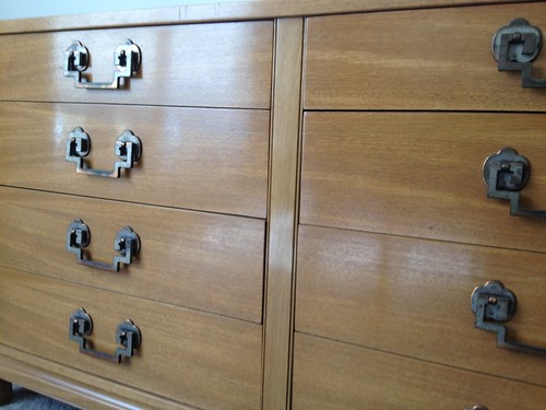
And I found this vintage dresser at a thrift store for $60, it functions like a credenza. It needs to be painted white but for right now the natural finish is tolerable.
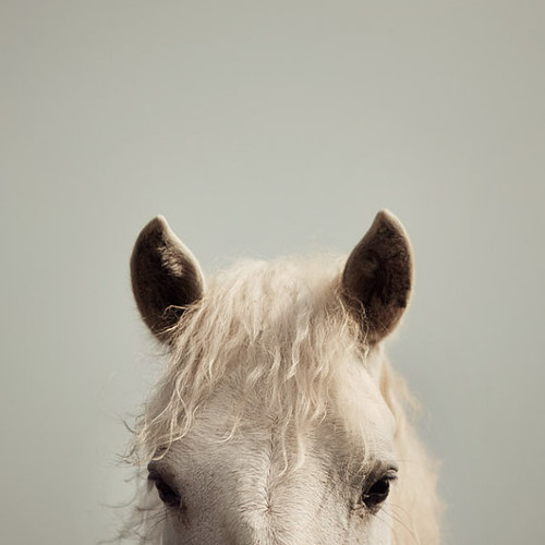
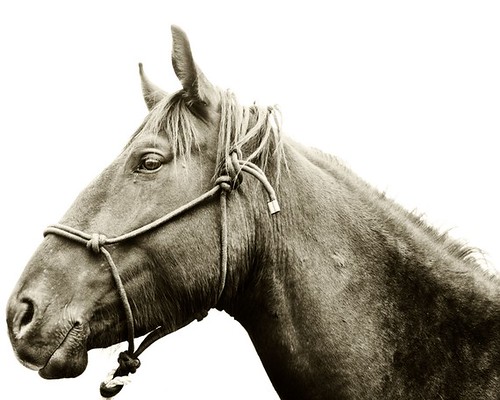
I plan to scoop this horse-y for over the dresser,
Or this b + w photograph–I’ve been watching this one for a while,
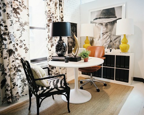
I like the idea of a b + w image in this spot, I was inspired by the photo of the woman at the Lonny office, not sure if the image is by Patrick Cline?
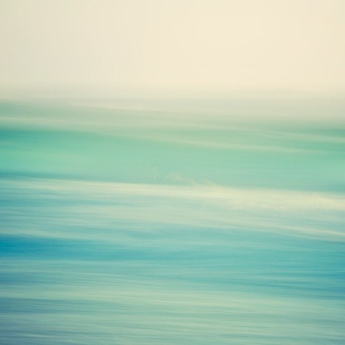
But on second thought I could always be persuaded by a good abstract ocean landscape,
Another element I’m waffling over is the light fixture. I was almost convinced that I would order this,
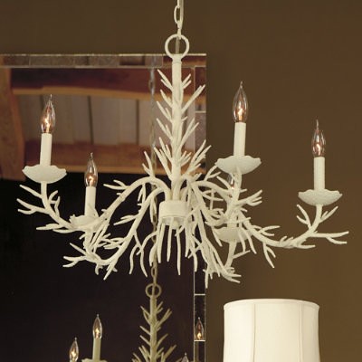
In a way, I consider it to be an affordable version of a Stray Dog Design. I was all set to order until I read the reviews. The most concerning was that it wasn’t pure white. I’m not really looking for an off-white or a gray-white in this room. And I don’t really know how I feel about paying that much and then spraying it white?
And so everyday I look at more light fixtures in hopes that just the right one will emerge.


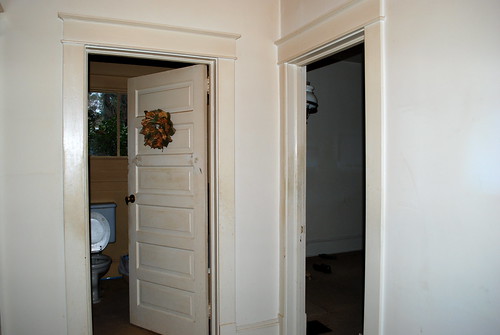


I’d like to see a before picture of the office? Do you have?
I love the paint color choice, and really hope that the more whimsical of the two horses makes the cut. It’s beautiful. And kind of cool to have two different animals staring at you dead on in the space….. The carnival fair animal and the gypsy horse.
I do not– but it had flat white walls and white mini blinds. Still looking at horses and I like your animal perspective. Even Patrick Cline’s horses are too rich-y for me.
I was just catching up on your blog and saw the bit about the chandelier you love. You know, I bet it won’t read off-white when set against the navy blue walls. It will be so far removed from any other white, that it would probably be very hard to tell. Just an idea since you seem to love it so much.
Camille
Thanks Camille now I’ve got second thoughts concerning the whole beachy thing
Hmm is anyone else having problems with the images on this blog
loading? I’m trying to figure out if its a problem on my end or if it’s the
blog. Any responses would be greatly appreciated.