
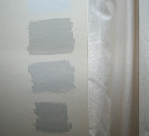
These paint samples were up for two weeks in the master bedroom and in the downstairs hall. The colors are all Benjamin Moore. The image below shows the samples in the hall. Moving left to right,
Paper White, Wickham Gray, Moonshine
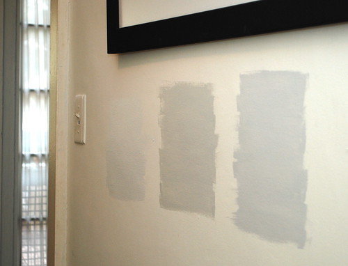
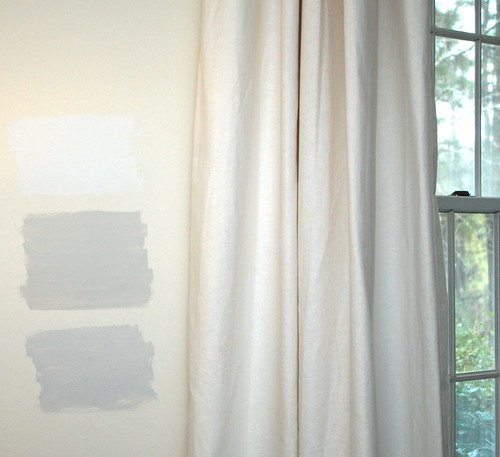
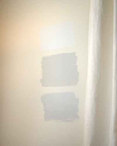
I was pretty frustrated with the light when I was taking these pictures but the end result turned out to be an accurate representation of the colors. The same set of colors are again sampled this time in the master bedroom.
Here’s how the decision making process went-
Moonshine looked great on the color chip but it has too much of a lilac tone at different times during the day. Paper white is way too stark so it was excluded quickly. Wickham Gray is the clear front runner at this point. I intended to sample Ben Moore’s Gray Owl but I never got around to it.
 A lot of you commented that you liked Wickham Gray and so did I and so that was the choice. Here is the result,
 I’m happy, what do you think?


In the pictures I really like Moonshine (seems like this is a popular color in the design world), but I can definitely see how that could have a lilac tint depending on the light. So clearly out of three swatches the Wickham Gray may suit the room best. Must see Gray Owl.
Love all of them, I wouldn’t be able to decide!
For the moment I prefer Wickham Gray. I think it’s the one with a touch warmer. But is this what you are looking for?. Gray Owl sounds good. We hope to decide.
Saludos!
I’m getting ready to paint my entire lower level Wickham. It’s the perfect gray!
Sarah,
I’ve used Wickham Gray in projects before at an old job (sadly, I don’t have pictures) and each time it looked fabulous!
Can’t wait to see what you decide and a picture of the finished project!
Wickham…hands down.
I have used all 3 in projects and paper white for my house. In my living room the paper white goes a bit blue. It is surrounded by chocolate candy brown and fire dance. My clients huge entry hall was painted in moonshine, which was a perfect light neutral gray. Did not seem lilac with her other finishes. Wickham is great if you need or like a bit more muddy light gray.
No contest for me….Wickham Gray!
I agree with you on the Wickham Grey … it looks warmer and better in the different light! Cant wait to see the other choice and what you decide!
Wickham Gray is my pick. There is a lot of light in the room coming from the two bay windows. There will also be a lot of white trim in the room including the double closet doors. Here is your chance to show some color.
I am going through the EXACT SAME process. The winner in my neck of the woods appears to be Whetstone Gray, a Martha Home Depot color. It’s a warmer gray with beige undertones. I found many of the other grays I tried to be too blue. Wickham is definitely the best of the bunch you’ve got going there. Love your blog, by the way!
Stan- still home sick I see. I will be showing some color soon-just ye wait, the office upstairs may be a dark blue
I actually love the Paper White. My entire house is painted from that swatch – Adagio in the living room, Blue Spring in the breakfast room and upstairs bathroom, Sterling in the foyer, hallway, and kitchen, and I plan to paint my dining room with Paper White (the room is floor-to-ceiling board & batten). We also are still considering Shaker Gray for our exterior. I agree the swatch offers stark gray/blues, which I tend to be drawn to.
Just took the Paper White swatch over to the Grout Cottage project but I think its too subtle and I’ll get a bunch of flack from the others working on the project about lack of color.