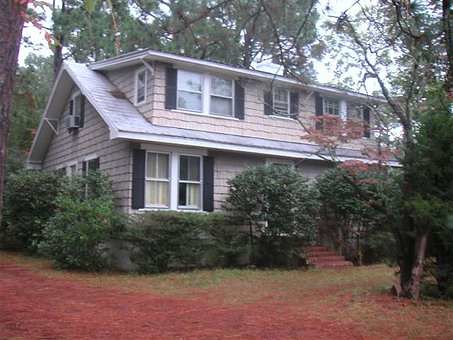
We were in the throws of paint color selection last week at the Indiana house. Up first…exterior paint.
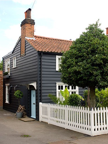
Remember this is some of our inspiration,
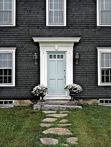
also joining the pack of inspiration is this combination, which is really a reverse of the two examples above

photo above & below via lumierefl
Honestly, I’m dying to paint something midnight blue but I don’t think this is the house.
Last week, we hashed it out over colors and this is what we initially narrowed it down to,
1. Iron Mountain, BM
2. Gabardine, Martha Stewart
3. Stonington Gray, BM
4. Mushroom, MS
Sherwin Williams came in to play because our painter prefers SW’s exterior paint called Duration.
Mushroom emerged as the front runner in this group. But we weren’t sure so we added more to the field.
5. Liveable Green, SW
6. Softened Green, SW
Liveable Green did not live up to it’s name at all. Softened green was a strong contender.
Our decision went down to the wire last week and we all were having a really hard time selecting, we even had to call in our real estate agent for an opinion.
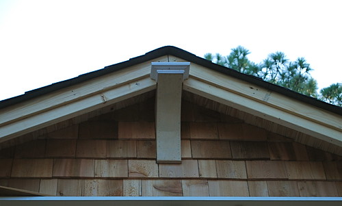
Finally after stretching our painter’s patience to the max, we settled on Mushroom. Our reasoning, we have incorporated some craftsman elements and many craftsman homes were painted to be in harmony with their surroundings. Also, some of the old shakes have some imperfections, the darker olive green provided better coverage.
FAIL.
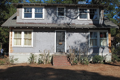
Mushroom was a complete and total failure, it was muddy in stead of olive and it was too oppressive and dark. The Indiana project was a giant, swampy mud puddle of a house.
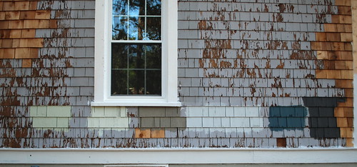
Back to the drawing board and more samples,
7. Clary Sage, SW
8. Enamelware, MS
9. Sea Salt, SW
10. Rainwater, MS
Recovery.
FINALLY we ended up with…

Martha Stewart, Rainwater

Martha Stewart, Mushroom
Rainwater is the body of the house, Mushroom is on the gables and is an accent color, stay tuned for a white trim color. The colors on my monitor do not look like these colors do in person, so you’ll just have to wait for the finished product.
I can sleep again.


Great choice of colour, grey is so classy and luminous. I painted 2 tables in grey this weekend and they got an instant new life!
Dang. changing up on the exterior paint of a house after the color didn’t turn out right sounds like a decision that would be hard to swallow. I love your dedication to perfection.
A bitter pill indeed.
I love that dark blue color and would love to know what it is.
Rose-the dark blue I think you are referring to is Martha Stewart’s Gabardine.
or you might be talking Iron Mountain which is a Benjamin Moore color?
“can’t wait to hear you tell everyone about how you’re painting it again. that’s embarrassing.”
— Dan
The darkest option (like the top 2 inspiration images) is really amazing. I’m guessing it got ruled out, but would love to hear how that decision process went down….
Dan’s salt in the wound comment wasn’t needed but thanks to Timmy for putting it on repeat. Betsy- you’ll be glad to know that we are going back to dark.
Thanks, Sarah, sorry I wasn’t too clear on which one I was talking about. I was referring to the second one on the right (on the photo with all the paint swatches painted on the house). That’s a really amazing blue.
I also think Dan’s comment is uncalled for as well as Timmy’s repeat of it. I think one of the harder part of design is choosing the right paint color. Even harder is picking a good one for the exterior of your home. You just don’t know what they will ultimately look like until they are up and sometimes it just doesn’t work even when it should.
Thats really nice of you to say. Thanks Rose! That is MS-Gabardine.